
Restoring Hidden Detail With Shadows/Highlights In Photoshop
In the previous tutorials in this series on tone and color correction in Photoshop, we learned all about the Brightness/Contrast image adjustment and how it can easily improve the overall tone and contrast of our photos.
First, we learned how to apply it directly to the image itself as a static adjustment. Then, we took things further by learning how to apply it as a non-destructive adjustment layer.
The Brightness/Contrast command is great for images that are looking a little flat and need a boost in contrast, but what about images that start out with too much contrast, with highlights that are too bright, shadows that are too dark and not much going on in between (the midtones)? Or how about photos where you want to leave the highlights alone and just brighten up the shadows, or leave the shadows alone and just dim down the highlights? These types of images are exactly what Photoshop's Shadows/Highlights image adjustment was designed for. As its name implies, Shadows/Highlights gives us separate control of the shadows and the highlights in an image, allowing us to easily bring out hidden detail in the lightest and darkest areas and reduce overall contrast by pushing more of the tonal range into the midtones, often resulting in a more pleasing image.
The only downside to the Shadows/Highlights command is that when you first launch it, you'll see only two sliders; one for the shadows and one for the highlights. These sliders, on their own, don't always do the best job. The real power of Shadows/Highlights lies in its advanced options that, for whatever reason, are hidden from us by default. It also doesn't help that these hidden options, while easy to use, are not the most intuitive things to understand (which might explain why they're hidden). In this tutorial, we'll learn how to access the full range of options and explore how each one works. By the end, I think you'll find that not only is Shadows/Highlights simple to use, but that it does such a great job of bringing out detail, you'll be trying it on photos that didn't even seem to need it!
As with all tutorials in this series, I'm using Photoshop CC (Creative Cloud) but everything is also fully compatible with Photoshop CS6.
Here's a photo I snapped one afternoon of a duck enjoying a swim and a drink in a small pond. He seemed pretty happy to have found it, so I didn't have the heart to tell him that his "small pond" was really just a large puddle. Unfortunately, it was a bright, sunny day and I didn't use a fill flash on my camera, so the image ended up with too much contrast. Let's see how a Shadows/Highlights adjustment can improve it:

Before we begin, it's important to keep in mind that as powerful as Photoshop is, it can't bring out detail that simply isn't there. If the shadows in your image are so dark they're pure black, or if your highlights are just areas of solid white, there won't be any detail in those areas to restore. If there is detail though, the Shadows/Highlights command can work wonders. So, having said that, let's get started!
Step 1: Duplicate The Background Layer
Unlike the Brightness/Contrast command that we looked at previously, Shadows/Highlights is one of the few image adjustments in Photoshop that is not available to us as an adjustment layer. There is a trick, as we'll see in the next tutorial, that lets us apply it non-destructively, but for now, we'll focus on how the Shadows/Highlights command works and how to apply it as a static adjustment.
The term static adjustment means we're applying the adjustment directly to the pixels in the image. We don't want to make changes to the original photo (in case we ever need it again), so let's make a copy of our image and place it on a separate layer. We'll then apply the Shadows/Highlights command to this separate layer, leaving the original photo unharmed. If you've just opened your image in Photoshop, you'll see it sitting on the Background layer in your Layers panel:

To duplicate the layer, go up to the Layer menu in the Menu Bar along the top of the screen, choose New, then choose Layer via Copy. Or, press Ctrl+J (Win) / Command+J (Mac) on your keyboard to select the same command using the handy shortcut:

Photoshop makes a copy of the image and places it on a new layer named "Layer 1" above the Background layer. Notice that the new layer is highlighted in blue which means it's now the currently active layer. Anything we do to the image at this point will be applied to this new layer, not the original image:

Step 2: Rename The New Layer
Since the name "Layer 1" doesn't tell us anything about what the layer is being used for, let's rename it. Double-click directly on the new layer's name to highlight it:

With the name highlighted, type in "Shadows/Highlights" as the new name, then press Enter (Win) / Return (Mac) on your keyboard to accept it:

Step 3: Choose The Shadows/Highlights Image Adjustment
To apply the Shadows/Highlights command, go up to the Image menu at the top of the screen, choose Adjustments, then choose Shadows/Highlights:

This opens the Shadows/Highlights dialog box. As I mentioned, by default, only two sliders are available to us, both labeled Amount; the top one is for the Shadows, and the bottom one is for the Highlights. Each slider is set to its default value, with the Shadows Amount set to 35% and the Highlights Amount set to 0%:

What do these default values mean? The Shadows Amount and the Highlights Amount both do the same thing, except that they work in opposite directions. The Shadows Amount increases brightness in the darker tones of the image, while the Highlights Amount decreases brightness in the lighter tones. The Amount value, which we can change by dragging the slider, determines how much lightening or darkening is being applied. At their default settings, the shadows (the darker areas) are being lightened by 35%, while the highlights (the lighter areas) are not affected at all.
Here's what my image looks like with these default values applied. Already, we can see that the shadows have brightened up, bringing out more detail in the darker areas. The highlights, however, are still just as bright as they were before:

If I want to decrease the brightness in the lighter areas as well, I need to increase the Highlights Amount value by dragging the slider towards the right. I'll increase my Highlights Amount to the same 35% that the Shadows Amount is set to, just as an example:

By increasing the Highlights Amount, I've dimmed down the highlights, making it easier to see detail in the lightest areas. And, with the shadows now lightened and the highlights darkened, more of the tonal range of the image has been pushed into the midtones, resulting in reduced overall contrast:

The Preview Option
To compare your adjusted image with the original version, click the Preview option's checkbox to toggle it on and off. With Preview off (unchecked), you'll see your original image in the main document area. With Preview on (checked), you'll see the adjusted version. You can also toggle the preview on and off by pressing the letter P on your keyboard:

Step 4: Select "Show More Options"
So far, we've learned that we can increase brightness in the shadows and decrease brightness in the highlights using the Amount sliders. Problem is, on their own, these Amount sliders can only do so much. For example, it's great that we can brighten the shadows, but what exactly qualifies as a shadow? In other words, how dark does an area have to be for it to be considered a shadow and affected by the Amount slider? Likewise, how light does an area have to be for it to be considered a highlight? To get the most from Photoshop's Shadows/Highlights command, we need more control than what the Amount sliders give us. We need the advanced options, and we can view them by selecting Show More Options:

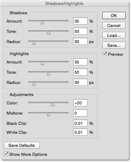
This expands the Shadows/Highlights dialog box to its full size, revealing all the options available to us. At first glance, these additional options may seem overwhelming, but if you look closely, you'll notice that they're actually divided into three bite-size chunks. We have a Shadows section on top, a Highlights section in the middle, and an Adjustments section at the bottom. And, if you look even more closely, you'll notice that while the Shadows and Highlights sections each have three sliders now instead of just one, they actually have the same three sliders (Amount, Tone and Radius), and they function essentially the same. This means that once you understand how they work in one section, you'll know how they work in the other. So really, there's not as much to learn here as it may seem.
Note that I'm using Photoshop CC 2014 (available with an Adobe Creative Cloud subscription). In CC 2014, Adobe made a few minor changes to the names of some of these options. If you're using Photoshop CS6 or the original Photoshop CC, the Tone option in both the Shadows and Highlights sections is named Tonal Width, and in the Adjustments section, Color is named Color Correction and Midtone is Midtone Contrast. Other than these minor name changes, these options function exactly the same in all versions. For this tutorial, I'll refer to them by their most recent names (Tone, Color and Midtone), but again, their functions haven't changed:
The Shadows Adjustment Options
Let's look first at the three options in the Shadows section. As I mentioned, once you understand what these options do here, you'll know what they do in the Highlights section as well.
Amount: The Amount slider does the same thing here as it did before. It simply controls how much brightening is being applied to the darker tones in the image. Drag the slider towards the right to increase brightening, bringing out more shadow detail, or to the left to decrease it. There's no "one size fits all" value to use since every image is different, so you'll need to keep an eye on your image as you drag the slider to judge the results. I'll increase mine to around 40%, but don't worry about getting it perfect just yet. Once you adjust the other two sliders, you'll most likely want to come back and re-adjust the Amount value anyway. As long as the Shadows/Highlights dialog box remains open, you're free to experiment with the sliders as much as you need:

Tone: If the Amount slider controls how much brightening to apply to the shadows, the Tone (Tonal Width) slider controls exactly what should be brightened. I mentioned a moment ago that what we need in addition to the Amount sliders is a way to control how dark an area needs to be for it to be considered a shadow, and how light it should be for it to be considered a highlight. That's exactly what the Tone sliders do; they determine the range of tones that should be considered either a shadow (in the Shadows section) or a highlight (in the Highlights section).
In the Shadows section, lower Tone values limit the Amount slider's effect to just the darkest areas in the image (the ones at or near pure black). Dragging the slider towards the right expands the tonal range to include more of the midtones. If you drag the Tone slider all the way to the right to its maximum value of 100%, every tone in the image, from pure black to pure white, will be affected to some degree by the Shadows Amount slider.
By "some degree", I mean that Photoshop does not apply the brightening equally across the tonal range. It's more of a gradual transition, with darker tones affected more than lighter tones. At the default Tone setting of 50%, everything from pure black to 50% gray in the image would be considered a shadow and affected by the Amount slider, but the darkest areas would be affected the most, while lighter areas would have less brightening applied.
Generally, leaving the Tone value at its default 50% is the safest choice, and that's true for both the Shadows and the Highlights. That's because, at these default settings, the dividing line between shadows and highlights essentially runs straight through the middle, with the Shadows Amount slider affecting the darker half of the tones and the Highlights Amount slider affecting the lighter half. If you increase, say, the Shadows Tone value beyond 50%, you'll create an overlap where some of the tones in your image will be considered both shadows and highlights and affected by both Amount sliders at the same time, often producing strange results.
There's nothing wrong with increasing the Shadows Tone value beyond 50% if it makes your image look better, but if you do, it's a good idea to decrease the Highlights Tone value by an equal amount, and vice versa. As with the Amount slider, there's no specific value to use here. You'll need to keep an eye on your image as you drag the slider to determine which setting works best. For my image, I'll leave it set to 50%:

Radius: So far, we've learned that the Amount slider controls how much brightening to apply to the shadows, and the Tone slider controls the range of tones that are considered shadows. The Radius slider is a bit different. It controls how much the affected areas blend with the unaffected areas surrounding them. Picture in your mind, for a moment, a dark area of your image that's being brightened by the Amount slider. Now picture the areas around it; the ones that are not directly affected but live in the same neighborhood. The Radius slider controls how far the adjustment will extend into this neighborhood.
Why would you want the neighbors affected? It's because it creates smoother, less noticeable transitions between the adjusted areas and the rest of the image. Setting the Radius value too low often produces bright outlines known as halos around the adjusted areas, similar to what photos look like when they suffer from too much sharpening. Increasing the Radius value softens and spreads out the transitions into the surrounding areas, creating a more natural looking result. In general, higher Radius values work best, but again, it will depend on your specific image. And, since the Radius value is measured in pixels, it will also depend on the size of your image, with larger images (with more pixels) needing higher Radius values than smaller images (with fewer pixels) to create the same effect:

Here's my photo with my current Shadow Amount, Tone and Radius settings applied:

The Highlights Adjustment Options
The three sliders in the Highlights section work essentially the same as they do in the Shadows section. The Amount slider controls how much darkening is being applied to the highlights. The further you drag the slider towards the right, the more darkening is applied and the more highlight detail you'll recover (assuming of course that there is actual detail to recover, since Photoshop can't magically produce detail in areas that are severely overexposed and blown out to pure white).
The Tone slider determines the range of tonal values that should be considered highlights. At its lowest setting, only the lightest areas of the image (the areas at or near pure white) will be affected by the Amount slider. Increasing the Tone value expands the tonal range more into the midtones, and at its maximum value of 100%, every tone from pure white to pure black would be considered a highlight (which is usually not what you want). At its default setting of 50%, every tone from 50% gray up to pure white in the image will be darkened by the Amount slider, and as I mentioned, if you increase it beyond 50%, you'll usually want to lower the Tone value in the Shadows section to avoid an overlap. Just like with the shadows, Photoshop applies the darkening to the highlights as a gradual transition, with the lightest tones being affected the most and darker tones less affected.
The Radius slider controls how the areas affected by the Highlights Amount slider blend with their surroundings, with higher Radius values creating smoother, more natural looking transitions. Again, larger images generally require higher Radius values than smaller images to produce similar results.
I'll lower my Amount value down to 20%, leave my Tone value set to the default 50% and increase the Radius value to somewhere around 90 px:

Here's what my image looks like after dimming down the highlights. Both the darker and lighter areas now contain more detail, and the overall contrast has been reduced:

More Adjustments
The last two sliders, found in the Adjustments section, help us compensate for problems that may have been introduced by our shadows and highlights adjustments. The first one, Color (Color Correction) is designed to fix problems with the overall color saturation. In fact, it's really nothing more than a saturation slider. If, after brightening up the shadows and dimming down the highlights, you find that the image isn't as colorful as it was before, drag the Color slider towards the right to boost saturation, or drag it towards the left to reduce saturation if needed. The default Color value is +20. I'll increase mine to +30. As with all the sliders in the Shadows/Highlights dialog box, your value will depend on what looks best with your image:

If brightening the shadows and darkening the highlights has left your image looking a little flat in terms of contrast, the Midtone (Midtone Contrast) slider can be used to compensate for it by increasing contrast in the midtones. I'll increase mine to +19:

The remaining two options, Black Clip and White Clip, determine what percentage of your shadows will be clipped to pure black (Black Clip) and what percentage of your highlights will be clipped to pure white (White Clip). Generally, you can ignore these options and leave them set to their default values:

I'll press the letter P on my keyboard to toggle the Preview option on and off so we can see a before and after comparison. Here is my original image once again:
And here's the final, adjusted version after boosting color saturation and midtone contrast:

Saving Your Settings As Defaults
If you like the settings you've applied and want to use them as your starting point from now on, you can save them as new defaults by clicking the Save Defaults button. The next time you select the Shadows/Highlights image adjustment, it will open with all of your settings ready to go:

To reset the defaults at any time, press and hold the Shift key on your keyboard. This will change the Save Defaults button to a Reset Defaults button. Clicking it will restore everything back to the original factory settings:

Resetting The Options
To quickly reset all of the options in the Shadows/Highlights dialog box back to their default values, press and hold the Alt (Win) / Option (Mac) key on your keyboard to change the Cancel button to a Reset button, then click the Reset button:

Applying Your Settings To The Image
Finally, when you're happy with the way your image looks, click OK close out of the Shadows/Highlights dialog box and commit your settings to the image:

With the settings applied, you can compare your adjusted version with the original by clicking the layer visibility icon for the Shadows/Highlights layer in the Layers panel. Click the icon once to turn the layer off and view your original image. Click it again to turn the layer back on and view your adjusted version:
And there we have it! In this tutorial, we learned how to brighten shadows and darken highlights in an image to restore hidden detail using a Shadows/Highlights adjustment. Photoshop may not let us apply Shadows/Highlights as an adjustment layer, but in the next tutorial, we'll see how we can still get all the benefits of an adjustment layer by learning how to apply Shadows/Highlights as an editable Smart Filter!