
Applying A Brightness/Contrast Image Adjustment In Photoshop
So far in our series on correcting tone and color problems in our images, we've looked at Photoshop's three Auto image adjustments (Auto Tone, Auto Contrast and Auto Color) and how they can instantly boost contrast, and even remove an unwanted color cast, from a photo.
We then learned how we can apply these Auto commands as adjustment layers to keep our image editing non-destructive.
While the Auto commands in Photoshop have their place, and are certainly popular thanks to the fact that they run on auto-pilot, they don't always do the best job. In fact, when it comes to retouching our photos, the saying, "If you want it done right, do it yourself" is usually true. So in this tutorial, we'll look at the first of Photoshop's manual image adjustments, the Brightness/Contrast command. If you're new to Photoshop and "manual image adjustments" sounds a bit scary, don't worry. As we're about to see, using the Brightness/Contrast command couldn't be easier or more intuitive, especially since there's only two sliders; one for brightness, and one for contrast! How simply is that?
As with most of Photoshop's image adjustments, there's two different ways that we can apply Brightness/Contrast. One is as a static adjustment; the other is as an adjustment layer. We'll start in this tutorial by covering everything we need to know about how Brightness/Contrast works and how to apply it as a static adjustment. In the next tutorial, we'll take everything we've learned here and see how to apply the exact same command as a non-destructive adjustment layer. I'll be using Photoshop CC (Creative Cloud) for these tutorials but everything is fully compatible with Photoshop CS6.
You can easily follow along with this tutorial using your own image. Here's the photo I currently have open on my screen. This image is looking a little dark and flat. Let's see how Photoshop's Brightness/Contrast command can improve it, and how it can improve your own images just as easily:

Step 1: Duplicate The Background Layer
As I mentioned, we'll start by learning how to apply Brightness/Contrast as a static adjustment. The term static adjustment means that we're making changes to the actual pixels in the image. Normally, we want to avoid that as much as possible, not only because it alters the original photo but also because it makes it much more difficult to go back and edit our adjustments layer. Yet there are steps we can take to make our static adjustments less damaging and destructive. The best way to do that is by taking advantage of layers in Photoshop and applying the adjustment to its own layer that's separate from the original photo.
If we look in my Layers panel, we see my original image sitting on the Background layer:

To duplicate your image so you have a separate copy of it to work on, go up to the Layer menu in the Menu Bar along the top of the screen, choose New, then choose Layer via Copy. You can also use the handy keyboard shortcut for duplicating a layer, Ctrl+J (Win) / Command+J (Mac). Either way does the same thing:

Photoshop creates a copy of the layer, names it "Layer 1" and places it above the original. We can now apply our edits to this layer without harming the original image on the layer below it:

Step 2: Rename The New Layer
Photoshop likes to give new layers rather meaningless, generic names like "Layer 1" which doesn't tell us anything about what the layer is being used for. Let's fix that by renaming it. Double-click directly on the name "Layer 1" to highlight it:

Then, type in "Brightness/Contrast" as the new name. Press Enter (Win) / Return (Mac) on your keyboard when you're done to accept it. Renaming layers like this is a great habit to get into and can save you a lot of time and frustration:
Step 3: Select The Brightness/Contrast Image Adjustment
With the Brightness/Contrast layer selected (it should be highlighted in blue), go up to the Image menu at the top of the screen, choose Adjustments, then choose the very first one at the top of the list, Brightness/Contrast:

Photoshop will pop open the Brightness/Contrast dialog box. As I mentioned earlier, using Brightness/Contrast couldn't be easier because there's only two sliders, one labeled Brightness and one labeled Contrast:

Step 4: Click The Auto Button
Before you start dragging the Brightness and Contrast sliders, the first thing you'll usually want to do is click the Auto button, which was added as a new feature to the Brightness/Contrast command in Photoshop CS6. The Auto button lets Photoshop take its best guess at what adjustments need to be made, but it's actually a lot more than just a "guess". Photoshop looks at your image and compares it with similar images from other professional photographers. It then tries to match your result to theirs:

After pressing the Auto button, Photoshop may seem like it's just sitting there doing nothing for a few seconds, but that's because it needs time to analyze your photo. When it's done, the result is almost always an improvement over the way the image looked initially. In my case, Photoshop decided to set the Brightness value to 43 and the Contrast value to 14:

Here's what my image looks like with Auto Brightness and Contrast applied. It's already looking better:

Step 5: Adjust The Brightness And Contrast Sliders
If you remember from the tutorial on the Auto Tone, Auto Contrast and Auto Color commands, if we apply any of those commands to our image and don't like the way it looks afterwards, we're pretty much out of luck since they offer no way to adjust or fine-tune the results.
That's not the case with Photoshop's Brightness/Contrast command. Once you've tried the Auto button, you can then make your own manual adjustments to further improve the image using the Brightness and Contrast sliders. Dragging a slider towards the right will increase brightness or contrast, while dragging towards the left will decrease it.
In my case, I want the photo to have a bit more "pop", so I'll click on the Brightness slider and drag it to the left a bit to lower the brightness down to 38. Then, I'll boost the contrast more by clicking on the Contrast slider and dragging it to the right to a value of around 35.
Every image will be different, and everyone has their own personal taste, so there's no recipe here to memorize. Just keep an eye on your image in the document as you drag the sliders and choose the settings that work best:

Here's my result. For comparison, the original, untouched version of the photo is on the left. The version with my manual Brightness and Contrast adjustments is on the right:

Toggling The Preview On And Off
The reason we can see the adjustments in the document as we're working with the Brightness/Contrast command is because by default, the Preview option is selected. If you want to compare your results with the way the image looked before the adjustments, simply uncheck the Preview option. With it unchecked, you'll see your original image in the document. Check the option again to turn the preview back on and view your adjusted version (tip: you can quickly toggle the Preview option on and off from your keyboard by pressing the letter P):

Reliving The Bad Old Days With The "Use Legacy" Option
Just like the Auto feature, there's more going on behind the scenes with the Brightness and Contrast sliders than you may think, and the easiest way to see that is by turning on the Use Legacy option. It's off by default (and for good reason), so I'll click inside its checkbox to select it:

As you may have guessed from its name, Use Legacy tells the Brightness/Contrast command to behave the way it did at some point in the past, and that "some point" is prior to Photoshop CS3. Back then, Brightness/Contrast was considered the worst image adjustment in all of Photoshop. Most people stayed far away from it, and here's why. With the Use Legacy option turned on, watch what happens if I drag the Brightness slider all the way to the right, to its maximum value:

My image now looks washed out. That's because with Use Legacy enabled, Photoshop increased the brightness in an entirely linear fashion. In other words, it simply took every tonal value in the image (the highlights, the shadows and the midtones) and brightened them all by the same amount. Areas that were already bright enough? Brighter. Shadows that should remain nice and dark? Equally brighter. Everything in between? Yep, brighter. This is how things worked prior to Photoshop CS3:

Let's compare that with how things work these days (with "these days" being every version of Photoshop from CS3 on up). I'll uncheck the Use Legacy option to turn it off, then I'll once again drag the Brightness slider all the way to the right to its maximum value:

This time, the image still looks too bright (normally, you wouldn't increase the Brightness value this much), but notice that the darker areas are still dark, and that I still have detail in my highlights even with the Brightness value maxed out. It's almost as if Photoshop knew which tonal values needed to be brightened and which ones should be left alone, and in fact, that's exactly what's happened.
Unlike the legacy version which increased brightness in a linear fashion, the new Brightness slider is non-linear. It figured out which tonal values actually should be brightened, then adjusted them separately according to how much they should be brightened. This avoids brightening dark, shadow details, and it also prevents areas that are already very bright from being blown out to pure white, which is why you can still make out subtle details in the clouds (all of which disappeared when Use Legacy was turned on):

A similar thing happens when we lower the Brightness value. I'll turn Use Legacy back on, then I'll drag the Brightness slider all the way to left to its minimum value:

And here, we see that not only is the image much too dark but that all of the detail in the darker tones is completely gone, pushed to solid black. Again, that's because Photoshop took all the tonal values (the highlights, shadows and everything in between) and just made them all darker in equal amounts. Prior to CS3, Brightness/Contrast didn't know how to do anything more than this:

If I turn Use Legacy off and then lower the Brightness to its minimum value:

This time, I get a much improved result. Is it still too dark? Sure (again, you wouldn't normally lower the brightness this much), but look at how much detail remains. Photoshop once again figured out which tonal values should be darkened and by what amount. The changes were non-linear. And, just as with the highlights, Photoshop didn't clip the shadows to pure black, so much less detail was lost:

The Contrast slider works the same way, and we can see just how powerful it is these days by comparing it with the way it used to work. Here's my image with Use Legacy on after dragging the Contrast slider all the way to the right to its maximum value (I've set the brightness back to 0). The result looks more like some weird special effect, with nearly all detail in the image completely lost (and strange colors introduced). This is how it worked in Photoshop CS2 and earlier:

By leaving Use Legacy off, the same increase in contrast produces a much better looking image with all details preserved:

Let's try going the other way. I'll turn Use Legacy back on and drag the Contrast slider to its minimum value on the left, and... where'd my image go? The legacy version of Brightness/Contrast decreased contrast so much that it actually turned my photo solid gray! Image contrast doesn't get much lower than this:

Here's the same minimum Contrast value but with Use Legacy turned off. The image looks very flat (as you'd expect), but at least it still looks like an actual photo:

So, now that we've seen how bad of a job the Use Legacy option does, is there ever a reason to use it? Unless you need it for creating some special effect, then the simple answer is no. It's only there to remind us of how Brightness/Contrast used to work, and that's really just for the benefit of long-time Photoshop users. For us, it served as a great way to show just how powerful the Brightness and Contrast sliders have become. Now that we've done that, you can safely ignore the Use Legacy option forever.
Resetting The Brightness/Contrast Values
If you tried the Auto button and don't like the results Photoshop came up with at all, or you just want to clear away your settings and start over, press and hold the Alt (Win) / Option (Mac) key on your keyboard. This changes the Cancel button to a Reset button. Clicking Reset will set both the Brightness and Contrast sliders back to 0:

Step 6: Click OK
When you're happy with how the image looks, click OK to commit your settings and close out of the Brightness/Contrast dialog box:

Comparing The Original And Adjusted Versions
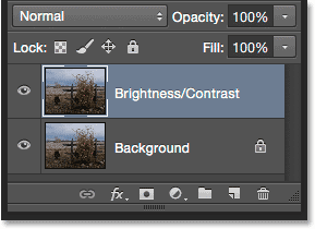
We saw earlier than we could compare our adjusted version with the original image as we were working by toggling the Preview option on and off. Now that we've committed our settings and closed out of the dialog box, we don't have access to the Preview option anymore, but there's still an easy way to compare them. To hide the adjusted version and view the original, just click the Brightness/Contrast layer's visibility icon (the "eyeball" icon) in the Layers panel:
This hides the top layer (the Brightness/Contrast layer) from view in the document, revealing the original image on the Background layer below it:
Click the same visibility icon again (the empty square where the eyeball used to be) to turn the Brightness/Contrast layer back on:
And view the adjusted version:

Step 7: Lower The Layer Opacity (Optional)
This last step is optional, but if you think you went a bit too far with your Brightness/Contrast settings, there's an easy way to reduce their impact. Make sure your Brightness/Contrast layer is still selected, then simply lower the Opacity value in the upper right of the Layers panel. The default opacity value is 100%, which means the Brightness/Contrast layer is completely blocking the original image from view. Lowering the opacity allows the original image on the Background layer to show through the Brightness/Contrast layer. The more you lower it, the less impact your adjusted version will have. I'm not going to do this with my image because I'm happy with the results, and you may be as well, but it's a nice, easy option to be aware of:

And there we have it! In this tutorial, we learned how to use a Brightness/Contrast image adjustment in Photoshop to improve the overall brightness and contrast of an image. The only downside is, we've applied it as a static adjustment, which means that once we've committed our settings, we can't go back and change them (at least not without undoing what we've done and starting over). In the next tutorial, we'll take everything we've learned here and see a better way to apply Brightness/Contrast, and that's as a flexible, non-destructive adjustment layer.