Using the New Clarity and Dehaze Adjustment Layer in Photoshop 2026
Learn how to use the new Clarity and Dehaze adjustment layer in Photoshop 2026 to boost edge contrast, enhance details and textures, cut through haze, and make portraits look stunning! A complete step-by-step tutorial.
Download the PDF: 2026 - Using the New Clarity and Dehaze Adjustment Layer
Photoshop’s January 2026 update added a powerful and highly-requested new feature called Clarity and Dehaze (really two features in one). Clarity and Dehaze have been part of Adobe Camera Raw and Lightroom for a long time. But now both are available as a single Clarity and Dehaze adjustment layer. In this tutorial, I show you how easy they are to use, and why (like me) you’ll be using them a lot.
Which Photoshop version do I need?
To use Clarity and Dehaze, you’ll need Photoshop 2026.
You can get Photoshop here or use the Creative Cloud Desktop app to make sure that your copy is up-to-date.
What are Clarity and Dehaze?
Clarity and Dehaze are both local contrast adjustments, which is why Adobe grouped them in the same adjustment layer.
- Clarity targets the midtones in your image. It looks for edges (areas with a sudden change in brightness from one pixel to the next) and boosts the contrast specifically along those edges by making the lighter side lighter and the darker side darker. This makes the details in your image
pop
without blowing out the highlights or crushing the shadows. - Dehaze finds areas in your image that look
flat
, where the contrast is lower than it should be (due to fog, glare or haze). Dehaze targets just those areas and restores the contrast and color saturation.
How to add a Clarity and Dehaze adjustment layer
There are a few ways to add a Clarity and Dehaze adjustment layer to your Photoshop document.
- From the Adjustments panel, make sure Single adjustments is selected at the top and choose Clarity and dehaze.
- From the Layers panel, click the New Adjustment Layer icon at the bottom and choose Clarity and dehaze.
- From the Menu Bar, open the Layer menu, choose New Adjustment Layer, then Clarity and dehaze.
Here I’m choosing Clarity and Dehaze from the Adjustments panel, which I find is the easiest way to work.

No matter how you add it, a Clarity and dehaze adjustment layer appears in your Layers panel.

The Clarity and Dehaze sliders appear in the Properties panel.

Clarity vs Contrast: What’s the difference?
Before we look at using the Clarity slider, it’s important to understand how Clarity is different from a standard Contrast adjustment.
- Contrast is a global adjustment. It boosts contrast in the entire image by making all the bright areas brighter, and all the dark areas darker, at the same time. It’s great for giving the image a visual
punch
. But if you push the contrast too far, you risk blowing out the highlights and crushing the shadows. - Clarity boosts contrast only along edges, which are usually found in the midtones. Clarity can bring out hidden textures and enhance fine details, giving the image an almost 3D look while keeping the brightest highlights and darkest shadows safe.

Using Clarity to adjust edge contrast in your image
The Clarity slider in Photoshop works best with images that benefit from enhanced detail, texture, and a sense of depth, such as:
- Landscape Photography: Clarity brings out fine details in mountains, rocks, foliage, and water, giving the scene more definition and texture.
- Architectural Photography: It sharpens the edges of buildings, enhances the texture of materials like brick or concrete, and gives structures a more solid, defined look.
- Nature and Wildlife Close-ups: Clarity emphasizes textures like fur, feathers, skin, or the veins of a leaf.: Clarity emphasizes textures like fur, feathers, skin, or the veins of a leaf.
- Portraits (Selectively): Clarity is excellent for enhancing textures in portraits, such as eyes, hair, and clothing, though it can be too aggressive on smooth skin (as we’ll see).: Clarity is excellent for enhancing textures in portraits, such as eyes, hair, and clothing, though it can be too aggressive on smooth skin (as we’ll see).
Clarity example 1: Wildlife photo
To see how Clarity works, we’ll start with this wildlife photo of an owl. Clarity should do a great job at bringing out texture and detail in the feathers, the eyes and the beak.

In the Adjustments panel, I’ll add a Clarity and dehaze adjustment layer.

The Layers panel shows the adjustment layer added above the Background layer (which holds the image). Since the adjustment layer is separate from the image, our edits will be non-destructive.

Increasing the Clarity amount
In the Properties panel, drag the Clarity slider to the right to increase edge contrast, or drag to the left to decrease it.
Increasing contrast brings out texture and detail, and creates the illusion of added sharpness. Decreasing contrast softens the edges for a more ethereal or dreamy look.
I’ll drag the Clarity slider to the right to increase contrast to +50.

To compare the Clarity result with the original image, click the eye icon in the Layers panel to toggle the adjustment layer on and off.
On the left is the original owl image. On the right is the same image after increasing Clarity. I’ve zoomed in to 100 percent to make the differences easier to see.
Notice how soft the original image looks on the left, compared with the result on the right after Clarity brought out textures and fine detail in the feathers, and made the eyes (and the beak) look sharper. Clarity can give the appearance of a sharper image even though it is not a sharpening filter.

What happens if Clarity is pushed too far?
Increasing Clarity too high can make the image look gritty and grainy because it starts detecting noise as edges to enhance. It can also add visible halos around edges, and give the image a bad HDR look.
I’ll increase the Clarity all the way to its maximum value (+100).

On the left is the original image. On the right is with Clarity at +100. Notice how harsh and crispy
the details look with Clarity set too high.
The best approach with Clarity is to keep an eye on your image as you drag the slider to find the sweet spot between too little and too much. Every image will be different.

Clarity example 2: Elderly man portrait
For a second example, we’ll use this portrait image of an elderly man. Increasing Clarity will help bring out more character in his face.

I’ve gone ahead and added a Clarity and dehaze adjustment layer above the image, as we see in the Layers panel.

With portrait images, generally you don’t want to push Clarity very high, otherwise skin details will look crunchy
. I’ll drag the Clarity slider to the right to a value of +20.

On the left is the original image. On the right is with Clarity at +20. I’ve zoomed in to 100 percent.
Notice the added detail in his eyes, the fine skin details (including his wrinkle lines), and especially in his whiskers compared to the original. His shirt also shows more texture and pattern detail after increasing Clarity.

The problem with using Clarity with portraits
Clarity can make portrait images look very bad very quickly, especially portraits of women where you generally want skin to appear softer. Clarity’s edge detection algorithm can be far too aggressive on skin, bringing out every pore, and every line and wrinkle. Even natural variations in skin tone can look like edges to Clarity’s algorithm when pushed too far.
As an extreme example (don’t try this at home), on the right is the image with Clarity raised to its maximum value (+100). The original image is on the left. The result may look artsy
with its extreme contrast. But the crunchy, leathery look is certainly not flattering, especially with those extreme shadows under his eyes.
In the next example, we’ll look at why using Clarity with a negative value can actually work better with portraits.

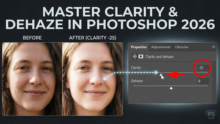
Clarity example 3: Young woman portrait
While increasing Clarity can have a negative effect on portraits, decreasing Clarity can make them look better, by softening skin details and adding a dreamy glow
to your subject. It’s an easy way to add the classic Orton Effect darkroom technique to your photo.
I’ll use this portrait image of a young woman as an example.

Again I’ve added a Clarity and Dehaze adjustment layer above the image.

If I increase Clarity to around +30:

Notice how the image looks worse. On the left is the original, and on the right is with Clarity increased. The shadows are darker (especially under her eyes), her skin tone looks more blotchy, and her hair is starting to look crunchy.

Compare that to what happens when we decrease Clarity. I’ll lower it to -25.

Decreasing Clarity reverses its edge detection algorithm. It still detects the edges, but instead of boosting contrast, it reduces it. As long as we don’t decrease Clarity too much, we keep the overall structure of the face while softening any harsh transitions, giving portraits a soft creamy glow that looks almost magical.
Again the original image is on the left. The Clarity effect using a negative value is on the right.

Pro Tip: Using Clarity with layer blend modes and opacity
Since we’re applying Clarity as an adjustment layer, we can take advantage of layer blend modes and layer opacity for even better results.
For example, if you find that Clarity is shifting the colors in your image or affecting color saturation, change the Clarity and Dehaze adjustment layer’s blend mode from Normal to Luminosity in the Layers panel. This gives you the same increase (or decrease) in edge contrast without affecting the color.

You can also lower the adjustment layer’s Opacity in the Layers panel to fade the Clarity effect and restore more of the original image.

Using Dehaze to cut through fog, glare and haze
While Clarity affects edge contrast in your image, Dehaze (the second slider in Photoshop’s new Clarity and Dehaze adjustment layer) works differently. The Dehaze algorithm looks for areas that appear flat
(where the contrast is lower than it should be) due to fog, mist, glare or, of course, haze.
Dehaze is based on a model of how light is transmitted through the air, and how it scatters when it hits particles in the atmosphere. The Dehaze algorithm guesses
how far away the objects are that are being obscured by the haze. The farther away the object is, the more it boosts contrast and color saturation to cut through
the atmosphere.
To see how Dehaze works, I’ll use this image that I shot in Alaska, which gives us an almost textbook example of the issue Dehaze was designed to solve.

Again I’ve added a Clarity and Dehaze adjustment layer above the image.

The Dehaze slider
In the Properties panel, begin dragging the Dehaze slider to the right to increase the value (negative values will add more haze to the image, which can sometimes be a useful effect).
Don’t expect to remove the haze completely. With Dehaze, there’s usually a point of diminishing returns where you’ve pushed it as far as you can go before noise and color banding start ruining the image. Also, setting Dehaze too high can make the areas you want to restore too dark. That’s because the algorithm pushes the darkest parts of the haze towards black.
For my image, a Dehaze value of around +45 looks good.

On the left is the original image. On the right is with Dehaze applied.

If you try to remove all the haze, you’ll usually destroy your image.
Here is the result with Dehaze set all the way to +100. Not only are the mountains too dark, but we’ve lost detail in the water. And because Dehaze pushed color saturation to an extreme, we have an almost sickening amount of blue and cyan.

Pro Tip: Use Dehaze with the Luminosity blend mode
Even at lower Dehaze values, the color saturation may seem too strong.
Here is my earlier result again with Dehaze at +45. To me, the saturation of the cyan in the sky doesn’t fit with the rest of the image.

To fix that by having Dehaze affect only the brightness in the image without changing the color, change the adjustment layer’s blend mode from Normal to Luminosity in the Layers panel.

On the left is the result with the adjustment layer set to the Normal blend mode. On the right is the adjustment layer set to Luminosity which restored the original color saturation.

Using Clarity and Dehaze together
Of course, you don’t need to choose between Clarity or Dehaze. Use them together to get the benefits of both.
I’ll leave Dehaze at +45, and I’ll increase the Clarity value to +50 to increase edge contrast and bring out more texture in the clouds.

On the left is the original image. On the right is the final result using a combination of Clarity and Dehaze, both set to the Luminosity blend mode.

Summary
In this tutorial, we looked at the powerful new Clarity and Dehaze adjustment layer in Photoshop. We learned that both Clarity and Dehaze are local contrast adjustments: Clarity enhances fine details and texture by boosting contrast along edges (midtones), while Dehaze intelligently cuts through atmospheric haze, fog, or glare by restoring contrast and color saturation in flat areas.
We learned that the adjustment layer allows us to apply Clarity and Dehaze to the image non-destructively, and that we can achieve even better results by combining the adjustment layer with layer blend modes and opacity..
Don't forget, all of my Photoshop tutorials are available to download as PDFs!
Related tutorials:
- How to Fix Nano Banana in Photoshop 2026
- How to upscale images with Generative Upscale in Photoshop
- Upscale AI images with Topaz Bloom in Photoshop 2026