Instant High Contrast Black and White Photos with Photoshop
Learn how to turn your images to high contrast black and white with Photoshop using Gradient Maps, the fastest and easiest way to create great looking B&W photos!
In this tutorial, I show you how to instantly convert photos to high contrast black and white in Photoshop using a Gradient Map. There are lots of ways to convert images to black and white, but Gradient Maps are one of the best because they are so fast and easy to use, and they give us great results. I’ll show you how to use a Gradient Map, and I'll show you the secret to why Gradient Maps give black and white photos such a high contrast look.
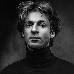
Here's an example of what the final high contrast black and white effect will look like when we're done:

Let's get started!
Which version of Photoshop do I need?
I used Photoshop 2021 but any recent version will work. Get the latest Photoshop version.
The document setup
I’ll use this image from Adobe Stock:

Gradient Maps vs Photoshop's Desaturate command
To really see how great of a job a Gradient Map can do with black and white photos, we'll compare it to Photoshop's Desaturate command, which is a quick way to remove the color from an image. Both Gradient Maps and the Desaturate command are essentially one-click solutions, so let's see which one is better at converting an image to black and white.
We'll start with the Desaturate command. In the Layers panel, the image appears on the Background layer:

Make a copy of the Background layer by dragging it down onto the New Layer icon:
Then double-click on the copy’s name (Background copy
):

Background copy.
And rename it Desaturated
. Press Enter (Win) / Return (Mac) to accept it:

Desaturated.
To remove the color, go up to the Image menu in the Menu Bar, then to Adjustments:

And choose the Desaturate command:

Photoshop instantly removes the color from the image, leaving it in black and white.
But the result is not very impressive. There are no dark shadows or bright highlights to give it that high contrast look we’d expect from a great black and white image. Instead, it just looks like what it is; an image with no color:

How to convert an image to B&W with a Gradient Map
So let’s compare the result from the Desaturate command to what we get using a Gradient Map.
I’ll turn the Desaturated
layer off by clicking its visibility icon:
Desaturatedlayer.
Step 1: Reset Photoshop's Foreground and Background colors
Before adding the Gradient Map, make sure in the toolbar that your Foreground and Background colors are set to their defaults, with black for the Foreground and white for the Background:

The reason is that by default, Gradient Maps use a gradient based on our current Foreground and Background colors. So if yours are set to different colors, click the small Reset icon above them. Or press the letter D (for Defaults) on your keyboard:

Step 2: Add a Gradient Map adjustment layer
Then to add a Gradient Map, go back to the Layers panel, click the New Fill or Adjustment Layer icon at the bottom:
And choose a Gradient Map adjustment layer from the list:

And instantly, we get a much higher contrast black and white image, with darker shadows, brighter highlights and more overall detail:

Comparing the results
Here’s a side-by-side comparison of the results from the Desaturate command (left) and the Gradient Map (right).
It’s easy to see how much better the Gradient Map's black and white version looks, even though it took the same amount of time. The higher contrast makes the image pop, with more detail in his face and hair, and more obvious textures in his sweater and in the background:

How Gradient Maps convert images to black and white
So why are Gradient Maps so good at creating high contrast black and white images? There’s really two reasons. And the first is because of how a Gradient Map works.
I cover Gradient Maps in much more detail in another tutorial where we learn how to color grade images with Gradient Maps. But long story short, a Gradient Map takes the original colors in your image and replaces them with the colors from a gradient.
In the Properties panel, we see the gradient that the Gradient Map is using. And by default, it’s based on our Foreground and Background colors, which is why we reset them to black and white:

Gradient Maps replace colors based on their brightness. So because we’re using a black to white gradient, the darkest colors in the image are being replaced with black or dark gray. The brightest colors are now white or light gray. And the colors with their brightness somewhere in the middle are now a shade of gray from the midtones in the gradient:

Why do Gradient Maps create high contrast images?
So that’s why the image was converted to black and white when we added the Gradient Map. But why does the black and white image have such high contrast? Why is the contrast with the Gradient Map not only higher than the desaturated version, but even higher than the original image? The reason is because of an option found in the Gradient Editor.
Opening the Gradient Editor
To open the Gradient Editor, click on the gradient in the Properties panel:

The Smoothness option
And here in the Gradient Editor, just above the gradient preview bar, is an option called Smoothness. By default, Smoothness is set to 100 percent. And that means that Photoshop is trying to smooth out the transitions between the different colors, or in this case the different shades of gray, in the gradient:

How Smoothness affects contrast
But this smoothing feature also increases the contrast in the gradient. It’s enhancing the difference between the dark and light tones by pushing darker tones more towards black and lighter tones closer to white. And this is what’s giving us that higher contrast look with our black and white image.
Watch what happens to the image if we lower the Smoothness down to 0 percent:

Suddenly we lose the higher contrast, and the black and white image now looks more like the result from the Desaturate command:

But when I increase the Smoothness back to 100 percent, the higher contrast returns:

Expanding and contracting the shadows and highlights
If you pay attention to the gradient preview bar as you increase and decrease the Smoothness value, you can actually see what’s happening to the gradient. Notice how far the darkest shades on the left and the brightest shades on the right are extending inward towards the midtones with Smoothness set to 100 percent:

But as you lower the Smoothness value, those darkest and lightest shades get pushed back toward the edges, which brightens up the midtones. And at 0 percent smoothness, we get a more natural transition from black to white:

I’ll leave the Smoothness at 0 percent for the moment and I’ll click OK to close the Gradient Editor.
And here’s a comparison between the desaturated version (left) and the Gradient Map with Smoothness set to 0 percent (right). Now that we’ve taken away the Gradient Map’s advantage by lowering the smoothness, the two versions look more similar, although the Gradient Map still looks a bit better:

Of course, the whole point of using a Gradient Map is to get that high contrast effect. So I’ll reopen the Gradient Editor and I’ll set the Smoothness back to 100 percent. Then I’ll click OK to close it. And now we’re back to the high contrast black and white image:
Summary
So I really just wanted to show you why Gradient Maps produce such high contrast black and white photos. But to use a Gradient Map, just make sure your Foreground and Background colors are set to the defaults. Press D on your keyboard if they’re not. Then in the Layers panel, click the New Fill or Adjustment Layer icon, choose Gradient Map, and you’re done!
And there we have it! But Gradient Maps can do so much more than convert images to black and white. They're also great for adding creative color effects to your images, which you can learn all about in my Color Grading with Gradient Maps tutorial.
If you found this lesson helpful, be sure to check out my other Photo Effects and Photo Editing tutorials. And don't forget, all of my Photoshop tutorials are now available to download as PDFs!