How to Color Grade Images in Photoshop with Gradient Maps
Give your photos a more cinematic look by learning how easy it is to color grade images in Photoshop using gradient maps. Watch the video or follow along with the written tutorial below it!
Download PDF: 2021 - Color Grading Images with Gradient Maps
In this tutorial, I show you how to color grade an image in Photoshop using a gradient map image adjustment. You'll learn how gradient maps work, why they are perfect for color grading, and how to use a gradient map to give your image a more cinematic look by replacing the photo's original colors with colors from a gradient.
I also show you how to combine gradient maps with layer blend modes for different results, how to save your gradient colors as presets that can be quickly applied to other images, and even how to drag and drop gradient maps from one image to another!
We've got a lot to cover, so let's get started!
Which Photoshop version do I need?
For best results with this tutorial, you'll need Photoshop 2020 or later. That's because Adobe made changes to the gradients in 2020 and earlier versions will look quite different. I'm using Photoshop 2021 but everything is fully compatible up to 2023. You can get the latest version of Photoshop here.
What's the difference between color grading and color correction?
Color grading and color correction are two different things. Color correction is all about fixing problems with the image by adjusting the exposure, the contrast, white balance and more.
But color grading is more about creativity. Color grading is the process of replacing the photo's original colors with colors that are more artistic. And the goal with color grading is not to show reality but to set the mood or tone of the image, to convey a sense of atmosphere or fantasy, or to give the image a more cinematic look.
Color grading is not a replacement for color correction. Instead, color grading is usually an extra step after the color correction is done. This tutorial assumes you have already color corrected your image.
Why are gradient maps great for color grading images?
As we’ll see, gradient maps are perfect for color grading because they make it easy to change the colors in your image based on their brightness values. Each color in the image, from the darkest shadow to the brightest highlight, is mapped, or linked, to the same brightness value in a gradient. Simply choose colors for the gradient, and those colors instantly become the new colors in the image! Let’s see how it works.
How to follow along...
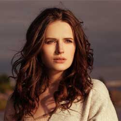
You can follow along with this tutorial by opening any image in Photoshop. I’ll use this image (outdoor portrait photo from Adobe Stock):
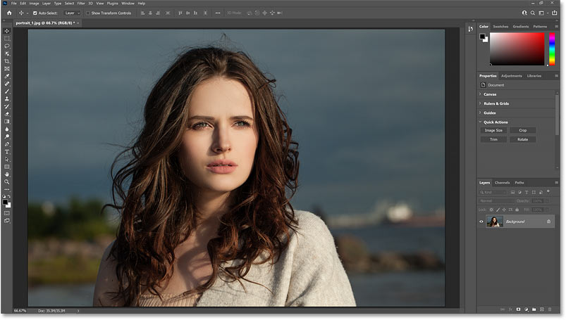
In the Layers panel, the image opens on the Background layer, which is currently the only layer in the document:

See also: Watch the video for this tutorial on YouTube
Step 1: Add a Gradient Map adjustment layer
The best way to use a gradient map in Photoshop is to apply it as an adjustment layer. The adjustment layer will keep the gradient map separate from your original image, and will make it easy to edit the gradient and try out different colors.
Method 1: From the Layer menu
There are a few ways to add a Gradient Map adjustment layer. One is by going up to the Layer menu in the Menu Bar:

Choosing New Adjustment Layer:

And then choosing Gradient Map:

Choosing an adjustment layer from the Layer menu opens the New Layer dialog box where you can name the layer before adding it. But I’ll click Cancel so we can look at two faster ways to add one:

Method 2: From the Adjustments panel
A second way is to open the Adjustments panel and click the Gradient Map icon (the last icon on the right, bottom row):

Method 3: From the Layers panel
And the third way is from the Layers panel. Click the New Fill or Adjustment Layer icon at the bottom:
And choose Gradient Map from the list:

The gradient map’s default gradient
Whichever way you choose to add it, the Gradient Map adjustment layer appears above the image in the Layers panel:

And by default, the gradient map converts the image to black and white:

Where do I find the gradient map options?
The options for the Gradient Map adjustment layer appear in Photoshop’s Properties panel. And here we see that the reason the image is in black and white is because by default, gradient maps use a black to white gradient.
So the original colors in the shadows are being replaced with black or dark gray, the highlights are replaced with white or light gray, and the colors in the midtones have all turned to the various shades of the gray in the middle of the gradient. We’ll come back to this and learn more in a moment:

Related: Using the enhanced Properties panel in Photoshop
Why is my default gradient not black to white?
If your gradient colors are something other than black and white, that’s because the default gradient is actually based on your current Foreground and Background colors, which just happen to be black (for the Foreground color) and white (for the Background color) by default.
So if your colors were set to something else when you added the gradient map, those colors will appear in the gradient and your image will look very different. But don’t worry because I’ll show you how to choose Photoshop’s actual Black, White gradient (and why you’ll want to do so) next.
Step 2: Open the Gradient Editor
To choose different colors for your image, edit the gradient by clicking the gradient preview bar in the Properties panel:

This opens the Gradient Editor. And notice that the name of our current gradient is “Foreground to Background”, not “Black to White”:

How to reset the gradient to black and white
But when choosing colors for your image, it’s usually best to start with a black to white gradient. So if your initial colors are not black and white, or to reset the gradient to black and white at any time, go up to the Presets area at the top of the Gradient Editor, twirl open the Basics folder (new as of Photoshop 2020) and choose the Black, White gradient by clicking its thumbnail:

Related: Find the missing gradients in Photoshop!
How gradient maps work
Before we start choosing colors, let’s learn more about how gradient maps work. Gradient maps replace the original colors in your image with the colors in your gradient. The original colors are mapped to the gradient colors based on their brightness values. And whichever color in the gradient has the same brightness value as the original color becomes the new color in the image.
The left side of the gradient represents the shadows in the image. The right side is for the highlights. And the middle of the gradient is the midtones:

Shadows on the left, highlights on the right
But it’s important to know that no matter which colors you choose, the left side of the gradient is always the shadows and the right side is always the highlights.
So with our current black to white gradient, we’re setting the shadows to black and the highlights to white. But if we swap the colors by dragging the black color stop to the right and the white color stop to the left:

The left side of the gradient is still the shadows and the right side is still the highlights. So now we're setting the shadows to white and the highlights to black, creating this inverted look:

Reset the gradient to black on the left and white on the right by reselecting the Black, White gradient in the Presets area:

Step 3: Edit the gradient colors
To add colors to the image, all we need to do is choose new colors for the gradient. I’ll start by showing you how to create a simple monochromatic look by adding a single color to the midtones. And then we’ll learn how to add colors to the shadows, the highlights, and anywhere in between.
Option A: Adding a single color to the midtones
An easy but effective way to color grade an image is to leave the shadows black and the highlights white and add a single color to the midtones.
Step A.1: Add a new color stop
In the Gradient Editor, add a new color stop for the midtones by clicking in the empty space below the middle of the gradient bar:

Step A.2: Set the color stop’s location to 50 percent
Ideally, we want this new color stop to appear exactly halfway between black on the left and white on the right. So set the Location of the color stop to 50 percent:

Step A.3: Choose a color for the midtones
Then to change its color, click the color swatch:

And choose a new color from the Color Picker. I’ll choose a brown-orange by setting the Hue (H) value to 30 degrees and the Saturation (S) to 20 percent. And because we set the Location of this color to 50 percent in the gradient, I’ll set the Brightness (B) value to the same 50 percent. When you’re done, click OK to close the Color Picker:

And with just that single color in the middle of the gradient, I’ve added a nice sepia tone to the image:

To try a different color, click the color swatch again:

And then choose a new color from the Color Picker. I’ll leave the Saturation (S) at 20 percent and the Brightness (B) at 50 percent, but I’ll change the color from orange to blue by changing the Hue (H) value to 210 degrees. Click OK to close the Color Picker:

And now I’ve gone from a sepia tone to a colder bluish tone:

Step A.4: Close the Gradient Editor
When you’re happy with the color, click OK to close the Gradient Editor:

Step A.5: Lower the adjustment layer's opacity
Of course, color grading an image does not have to mean replacing the original colors completely. In fact, you’ll usually want to dial back the new color and blend it with the originals. And the simplest way to do that is by lowering the opacity of the Gradient Map adjustment layer.
The Opacity option is found in the upper right of the Layers panel. The more you lower the opacity below 100 percent, the more you’ll fade the gradient map’s color and allow the photo’s original colors to show through.
I’ll lower the adjustment layer’s opacity to 50 percent:

At 50 percent opacity, I’m blending 50 percent of the color from the gradient map with 50 percent of the photo’s original colors. And now instead of replacing the original colors, I’m simply adding a bluish tint to them. We’ll look at other ways to blend the gradient map with the original colors a bit later:

Comparing the gradient map effect with the original image
You can toggle the gradient map on and off to compare its effect with the original image by clicking the adjustment layer’s visibility icon in the Layers panel:
On the left is my original image. And on the right is the effect from the gradient map:

Option B: Add multiple colors to the gradient
So now that we know how to add a single color to the midtones, let’s look at how to add colors to the shadows and highlights.
First, in the Layers panel, I’ll reset the opacity of my Gradient Map adjustment layer back to 100 percent:

Step B.1: Open the Gradient Editor
In the Properties panel, reopen the Gradient Editor by clicking the gradient preview bar:

How to delete a color stop
We’ll start once again with a black to white gradient, which means we don’t need the color stop in the middle that we added previously. To delete a color stop, click on it to select it:

And then click the Delete button:

You could also revert the gradient back to black and white by selecting the Black, White gradient from the Presets area.
And now we’re back to gradient and our image in black and white:

Step B.2: Select the left color stop and change its color
To add a color to the shadows, click the black color stop on the left to select it:

And then to change its color, click the color swatch. Or you can double-click directly on the color stop itself:

Then choose a new color from the Color Picker. I’ll choose a color that’s easy to see, like red, by setting the Hue (H) value to 5 degrees. Since this color is being used for the shadows, you’ll want to choose a dark shade. So I’ll set the Brightness (B) to 20 percent. And since dark colors need more saturation to avoid looking gray, I’ll set the Saturation (S) value to 80 percent:

Click OK to close the Color Picker. And the shadows in the image have gone from black to dark red:

Step B.3: Select the right color stop and change its color
Next, add a color to the highlights by double-clicking on the white color stop on the right:

And then choosing a new color from the Color Picker. I’ll go with yellow for the highlights by setting the Hue (H) value to 40. Since lighter colors don’t need as much saturation, I’ll set the Saturation (S) value to 30 percent. And since we want a bright color for the highlights, I’ll leave the Brightness (B) value at 100 percent:

Click OK to close the Color Picker. And now I’ve added yellow highlights to go with my red shadows:

Step B.4: Adjust the midpoint of the gradient (optional)
Notice the small diamond shape between the two color stops. If you can’t see it, click on either color stop to make it visible. This is the midpoint marker where the two colors blend together:

By default, the midpoint marker sits halfway between the two color stops. But you can drag the midpoint left or right to bring more of the highlight or shadow color into the midtones.
If I drag the midpoint to the left:

I brighten the midtones by pulling down more of the yellow highlight color and pushing the red color further into the shadows:

And if I drag the midpoint to the right:

Then I darken the midtones by pulling up more of the shadow color:

To reset the midpoint back to the middle, change its Location value to 50 percent:

Step B.5: Add a third color stop for the midtones
To gain even more control over the midtones, add a color stop below them, just like we did earlier.
Click in the empty space below the middle of the gradient to add a new color stop. Then make sure its Location is set to 50 percent:

Step B.6: Choose a color for the midtones
Double-click on the new stop to open the Color Picker:

And then choose a color. I’ll go with orange (halfway between the red shadows and yellow highlights) by setting the Hue (H) to 25 degrees and the Saturation (S) to 40 percent. And since this color stop’s location is at 50 percent, I’ll set the Brightness (B) value to 50 percent.
You don’t always need to match the brightness and location values exactly, but it helps to keep the location in mind so you don’t end up choosing colors that are too dark or too bright for that part of the image:

Click OK to close the Color Picker. And I now have three colors in my gradient; one for the shadows, one for the highlights, and one for the midtones. You can add more color stops to the gradient for even more control over your colors, but I’ll stick with three:

Step 4: Save your gradient as a new preset
At this point, we’re done editing the gradient. But if you want to use this same gradient again with other images, then before closing the Gradient Editor, save your gradient as a preset.
First, if you haven’t done this already, create a new group to hold your custom gradients. In the Presets area, scroll down to the last folder in the list. Then right-click (Win) / Control-click (Mac) on the folder and choose New Gradient Group from the menu:

Give the new group a name. I'll name mine My Gradients
. Then click OK:

The new group appears below the others:

Then give your new gradient a name. I’ll name mine Red_orange_yellow
. When you’re done, make sure your custom gradients folder is selected in the Presets area, and then click the New button to create the new preset:

The new preset appears as a thumbnail in the folder so you can quickly select it the next time you need it:

Step 5: Close the Gradient Editor
We’ve created our gradient and saved it as a new preset, which means we’re done with the Gradient Editor. So go ahead and close it by clicking OK:

Step 6: Change the gradient map’s blend mode
As I mentioned earlier, color grading an image does not usually mean replacing the photo’s original colors. More often, we want to blend the gradient map into them.
We’ve already seen that we can fade the gradient map into the image by lowering the adjustment layer’s Opacity value. Here’s my image with the opacity at the default 100 percent:

If I lower the opacity down to 40 percent:

Then instead of replacing the colors completely, I’m simply adding a red, orange and yellow tint to the original colors:

But a more powerful way to blend the gradient map and the image together is by using Photoshop’s blend modes. And there are three layer blend modes that tend to work best when color grading images; Normal, Color and Soft Light. We’ve already been using one of these blend modes whether we knew it or not. But let’s look at all three and compare them.
The Normal blend mode
The Blend Mode option is found in the upper left of the Layers panel, directly across from the Opacity option. And the default blend mode is Normal, which is what we’ve been using so far:

How the Normal blend mode works
Normal
really just means off
. There is no interaction at all between the active layer (the Gradient Map adjustment layer) and the image below it. And the advantage with using the Normal blend mode with a gradient map is also its disadvantage; the colorized version of the image has less contrast than the original.
I’ll increase the opacity of my gradient map back to 100% so we can better see what’s happening:

Normal = Less contrast than original image
On the left is my original image without the gradient map applied. On the right is with the gradient map set the Normal blend mode. And notice how much brighter the shadows are in the colorized version, and how much darker the highlights are:

The reason is that any color we choose for the shadows is naturally going to be brighter than black. And any color we choose for the highlights will be darker than white. So the lighter shadows and darker highlights result in an image with less overall contrast.
Whether you view the lower contrast as an advantage or a disadvantage depends on the look you want to achieve. Brighter shadows and darker highlights can be great for adding a more cinematic look to your photo. And you can always lower the opacity of the gradient map to bring back more of the original contrast:

The Color blend mode
But even at lower opacity values, the Normal blend mode still results in less contrast. So if you want to avoid lowering the contrast when color grading an image, then a better blend mode to try is Color:

How the Color blend mode works
The Color blend mode keeps the brightness values of the image below the adjustment layer and blends only the colors from the gradient map. The result is a colorized image with the same contrast as the original.
Color = Same contrast as original image
On the left is the original image, and on the right is with the gradient map set to Color. The overall contrast in both versions is the same. Only the colors have changed:

And here is a comparison between the Normal blend mode (left) and the Color blend mode (right):

Of course, you can still lower the Opacity value to bring back some of the original color. I’ll lower the opacity to 50 percent:

And here’s the result using the Color blend mode at 50 percent opacity:

The Soft Light blend mode
So the Normal blend mode results in less contrast than the original image, and the Color blend mode keeps the contrast the same. But what if you want a colorized version with even more contrast than the original? For that, you’ll want the Soft Light blend mode:

How the Soft Light blend mode works
Soft Light is one of several blend modes in Photoshop that boost contrast in the image. When used with a gradient map, Soft Light uses the shadow color in the gradient to further darken the shadows, and the highlight color to push the highlights even brighter. The result is a colorized version with higher contrast than the original.
Soft Light = Higher contrast than the original image
On the left is the original image, and on the right is with the gradient map set to Soft Light:

Here is a comparison of all three blend modes, with Normal on the left, Color in the middle and Soft Light on the right:

And just like we’ve seen with Normal and Color, you can always fade the effect of the Soft Light blend mode to dial back the contrast by lowering the gradient map’s opacity. On the left is the full effect with the gradient map’s opacity at 100 percent. And on the right is with the opacity lowered to 50 percent:

Step 7: Edit the gradient colors if needed
After changing the gradient map’s blend mode, the initial colors you chose for the gradient may need their brightness or saturation adjusted. So just click once again on the gradient preview bar in the Properties panel:

And then double-click on any of your color swatches to edit its color in the Color Picker:

How to try out different gradient maps with your image
Another advantage to adding gradient maps as adjustment layers is that we can add more than one to try out different colors. And we can easily switch between them to choose the one we like best.
Step 1: Turn off the original gradient map
In the Layers panel, turn off your original Gradient Map adjustment layer by clicking its visibility icon:

Step 2: Duplicate the adjustment layer
Then make a copy of it by dragging it down onto the New Layer icon (second icon from the right):

Step 3: Turn on the copy
The copy appears above the original. Turn on the copy by clicking its visibility icon:

Step 4: Set the layer blend mode
Notice that the copy is automatically set to the same blend mode as the original. In my case, it’s Soft Light. If you know the blend mode you’ll be using (Normal, Color, Soft Light), you can change it here before editing the gradient colors. I’ll leave mine at Soft Light:

Step 5: Open the Gradient Editor
In the Properties panel, the gradient preview bar shows that we’re currently using the same colors as before. Click the preview bar to open the Gradient Editor:

Step 6: Reset the gradient to black and white (optional)
If you find it easier to start with the black to white gradient, then in the Presets area of the Gradient Editor, select the Black, White gradient from the Basics folder:

Step 7: Choose new gradient colors
Then choose different colors for your gradient. This time I’ll choose teal for the shadows by setting the Hue (H) to 180, the Saturation (S) to 80 and the Brightness (B) to 35.
And for the highlights, I’ll choose orange by setting the Hue (H) to 25, the Saturation (S) to 50 and the Brightness (B) to 95.
Here’s the result, with the gradient map set to the Soft Light blend mode:

Step 8: Save your new colors as a preset
Just like we did before, you can save your new colors as a preset. In the Presets area, make sure your custom gradient folder is selected (mine is called “My Gradients”). Give your new preset a name. I’ll name mine “Teal_orange”. And then click the New button to save it.
Note, though, that saving your gradient as a preset only saves the colors. It does not save the blend mode you’re using in the Layers panel or the opacity value. So if choosing one of your presets gives you unexpected results, make sure the blend mode and opacity are set correctly:

Step 9: Close the Gradient Editor
Then click OK to close the Gradient Editor when you’re done:
Step 10: Switch between the Gradient Map adjustment layers
In the Layers panel, the gradient maps appear as separate adjustment layers above the image. You can toggle them on and off to choose the one you like best by clicking their visibility icons.
Be careful not to have both adjustment layers turned on at the same time, otherwise you will see the result of both gradient maps blending together (although that may also produce interesting results):

How to copy a gradient map to another image
Finally, once you’ve chosen your gradient colors in the Gradient Editor and you’ve set the blend mode and opacity for the adjustment layer in the Layers panel, it’s easy to copy the entire color grading effect over to a different image. We do that by copying the adjustment layer itself from one image to another.
Step 1: Open a second image
First, open a second image by going up to the File menu and choosing Open:

Then navigate to the folder than holds your image, click on the image thumbnail to select it, and click Open:

The second image opens in its own separate document:

Step 2: Switch to the original image document
Switch back to your original image (the one with the gradient map applied) by clicking its document tab:

Step 3: Drag the adjustment layer into the second image
In the Layers panel, click on the Gradient Map adjustment layer you want to copy over to the second image. In my case, I’ll copy the one on top with the teal and orange colors. Notice that its blend mode is set to Soft Light:

Drag the adjustment layer up and onto the tab for the second image document:

Keep your mouse cursor held down and over the tab until Photoshop switches to the second image. Then drag the adjustment layer down onto the second image:

Release your mouse button, and the color grading effect from the first image is instantly applied to the second image:

In the Layers panel, the Gradient Map adjustment layer appears above the image on the Background layer. And notice that its Soft Light blend mode was also copied over, so there’s no need to change it manually. Of course, you can still change the blend mode yourself or adjust the layer’s opacity if needed:

And there we have it! That’s everything you need to know to start color grading images using a Gradient Map adjustment layer in Photoshop!
Be sure to check out more of my Photoshop Basics or Photo Editing tutorials. And don't forget, all of my Photoshop tutorials are available to download as PDFs!