
Converting Color Photos To Black and White In Photoshop
In this tutorial, we'll learn how to easily convert a full color photograph into a beautiful, custom black and white image using a Black & White adjustment layer in Photoshop! I'll be using Photoshop CC here but this tutorial is also compatible with Photoshop CS6.
In Photoshop's earlier days, converting a color image to black and white was not as simple or as intuitive as it is today. At least, not if you cared about the results. Back then, many Photoshop users simply removed the color from the image, either by desaturating it or by converting it to Grayscale. These methods were quick and easy, and can still be used today. But they offer no control over what the black and version will look like. They simply toss away the color. And a color image, suddenly without color, often looks flat, dull and lifeless.
Rather than tossing away the color, what if we could somehow use the original colors in the image to help us convert it to black and white? What I mean is, what if we could adjust the brightness of specific areas in the black and white version based on the original color of those areas? What if we could darken the sky simply because it was blue, or lighten the grass because it was green? What if, instead of being something to throw away, the colors became the gateway, the key, to our black and white vision?
That's exactly what Photoshop's Black & White image adjustment was designed for. First introduced back in Photoshop CS3, a Black & White image adjustment lets us easily control the tonality of different areas in the black and white version using the image's original colors as our guide. It may sound like an advanced topic, but as we'll see, all it takes are a few simple sliders to turn a flat, colorless image into a black and white masterpiece.
But that's not all. By applying a Black & White adjustment as an adjustment layer in Photoshop, as we'll be doing in this tutorial, we keep the effect fully editable. And, we keep our black and white version completely separate from the full color original, which means that we can even restore some of the image's original color when we're done. Let's see how it works!
You can use any image of your own to follow along with this tutorial. Keep in mind, though, that while converting an image to black and white can be a great way to simplify it, remove distractions and bring focus to the main subject, not every photo will look better in black and white. If color plays an important part in the overall mood of the image, like the golden hues of a sunset, then a black and white version may not look as impressive.
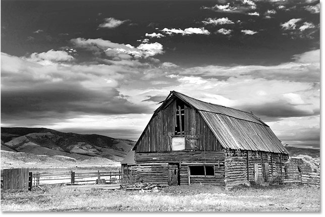
However, many photos can look stunning in black and white. And since we won't be making any permanent changes to the original full color image, there's no harm in giving them a try. Here's the photo I'll be using (barn photo from Adobe Stock:

Desaturating The Image
Before we look at how a Black & White image adjustment works, let's quickly desaturate the color in our image to see what we end up with. You won't need to do this every time you convert an image to black and white. We're just doing this here so we can compare the result we get from simply desaturating the image with what we're able to achieve with a Black and White adjustment.
Since we want to avoid making any permanent changes to the original color image, we'll desaturate it using one of Photoshop's Hue/Saturation adjustment layers. Click on the New Fill or Adjustment Layer icon at the bottom of the Layers panel:
Then choose Hue/Saturation from the list that appears:

Photoshop places the Hue/Saturation adjustment layer above the original image that's sitting on the Background layer. This means that anything we do with the adjustment layer will be kept separate from the image itself:

The controls and options for the Hue/Saturation adjustment layer appear in Photoshop's Properties panel. To desaturate the image, simply click on the Saturation slider and drag it all the way to the left, to a value of -100:

This removes the color, leaving us with a black and white version. In my case, the result isn't terrible; it's just not very interesting. The sky, grass and mountains in the background are all looking rather flat and dull, and the overall image is lacking contrast:

The reason is that, even though colors look very different to us in, well, color, they can actually look very similar to each other in black and white. Depending on their shades, many of the colors in your image may share similar brightness values. When you remove the color, and all you're left with are areas of similar brightness, the resulting black and white image looks flat.
What we need is a way to compensate for the similar brightness values; something that will let us lighten certain colors and darken others so that our once flat-looking image suddenly pops with contrast, detail and definition.
Let's turn off the Hue/Saturation adjustment layer for now by clicking on its visibility icon in the Layers panel. We’ll turn it back on later so we can compare this result with what we achieve using a Black and White adjustment layer:
With the adjustment layer turned off, we're back to seeing our original, full color image once again:
Adding A Black & White Adjustment Layer
To add a Black & White adjustment layer, click once again on the New Fill or Adjustment Layer icon at the bottom of the Layers panel:
Then choose Black & White from the list:

Just like with the Hue/Saturation adjustment layer that we added earlier, Photoshop places the Black & White adjustment layer above the image on the Background layer, keeping our black and white version and the original, full color version completely separate from each other:

The Default Settings
If we look at our image, we see that Photoshop has already gone ahead and converted it to black and white. The result isn't great, but it's a start:

To understand what's happened, let's look at the options and controls for the Black & White adjustment layer. You'll find them in the Properties panel. Notice the various color sliders. There's six of them in total; one for each of the three primary colors (Reds, Greens and Blues) and one for each of the three secondary colors (Yellows, Cyans and Magentas):

Each slider controls the brightness of a different color in the image. The Reds slider, for example, will lighten or darken any areas containing red. The Greens slider will lighten or darken areas of green. The Blues slider affects areas of, you guessed it... blue, and so on. Using these sliders, we can easily target specific areas in the image based on the color of those areas and then lighten or darken them as needed.
Notice that Photoshop has already gone ahead and set the sliders to specific values (Reds are set to 40, Yellows to 60, Greens to 40, and so on). These are the default values, and they'll be the same for every image. Our current black and white version is the result of these default values. We'll see how to adjust the values and create our own custom black and white version in a few moments:

Color? What Color?
Of course, it may seem odd that we're talking about adjusting the brightness of colors when the image has already been converted to black and white. Or has it? Remember, our Black & White adjustment layer is completely separate from the original image. If we turn off the Black & White adjustment layer by clicking its visibility icon in the Layers panel:

Our original, full color image returns:
And, when we turn the Black & White adjustment layer back on by clicking again on its visibility icon (the empty square):

The black and white version returns. Not only does this mean that our original image remains safe and unharmed, but it also means that, even while we're seeing the black and white version, the original colors are still there. Photoshop still knows that the sky is blue and the grass is green even while we're seeing them as shades of gray:
The Presets
Before we look at adjusting the sliders, let's take a quick look at the various presets that are available to us with the Black & White adjustment. We can access the presets from the Preset option above the sliders. Initially, the Preset option is set to Default, which is why we're currently seeing the default slider values:

Clicking on the word "Default" opens a list of presets that we can choose from, many of which are based on filters used in traditional black and white photography:

We won't go through all of the presets here since you can easily try them out on your own, but let's take a quick look at a few of them. I'll choose the Blue Filter preset from the top of the list:

In traditional black and white photography, color filters are used to lighten or darken different areas in the image by allowing or blocking different colors of light. A blue filter, for example, would allow blue light to freely pass through it while blocking other colors to various degrees. This causes areas of blue to appear much lighter in the black and white image, while other colors appear darker.
Since the sky in my image is very blue, it appears almost entirely washed out with the Blue Filter selected. Meanwhile, the greens, yellows and reds in the rest of the image now appear much darker:

If we look at the color sliders with the Blue Filter preset selected and compare them with the default values, we get a better sense of what's happened. The default settings are on the left and the Blue Filter settings are on the right.
Notice that the Reds, Yellows and Greens values have all been lowered in the Blue Filter preset, while the Cyans, Blues and Magentas have been increased. Lower values darken the colors; higher values lighten them:

Let's compare that to what happens when we try the Red Filter preset. I'll select it from the list:

A red filter would allow red light to freely pass through it, causing areas of red to appear lighter in the black and white image, while other colors would be blocked to some degree, making them look darker.
And here, we see the result. Since blue (and more specifically, cyan) is furthest away from red in the color spectrum, my blue sky becomes the darkest part of the image. Reds and yellows are the lightest (yellow contains lots of red), while areas of green fall somewhere in the middle:
And if we compare the color slider values for the Blue Filter and Red Filter presets, we again get a better sense of what's happened. The Blue Filter preset is on the left; the Red Filter preset is on the right.
Notice that the Reds, Yellows and Magentas values are all higher with the Red Filter preset, which explains why those areas now appear lighter in the image. The Greens value is slightly lower than it was with the Blue Filter preset, so not a huge change there, but the Cyans and Blues values are much lower, making them the darkest part of the image:

Let's look at one more preset. The give our black and white image a more unique look, we can try the Infrared preset:

Infrared photography captures light that's just beyond the visible spectrum ("infra" means "below", so "infrared" means "below red"), and it can give black and white images a magical, ethereal look. Grass and foliage become white, while skies and water darken to near black, creating striking contrast.
Notice the effect that the Infrared preset has on my image, as the area of yellow and green grass along the bottom is now almost pure white, while everything else, especially the sky, appears much darker:

And if we look at the color sliders in the Properties panel, we see that sure enough, the Infrared preset has set Yellows to the highest value, making them the lightest part of the image, with Greens not far behind. All of the other color values have been set much lower, with Blues, Cyans and Magentas being the lowest (and therefore the darkest):

Related: Non-Destructive Infrared Glow Effect
As I mentioned, we won't go through all of the presets here since you can easily try out the rest on your own. But after looking at a few presets and comparing their settings, we have a good idea of how the color sliders impact the brightness in different areas of the image.
While the presets can serve as a great starting point, the real fun is in creating our own custom black and white version. Let's restore the sliders back to their default values by setting the Preset option back to Default:

This returns us to the original, default black and white version of the image:
The Auto Button
There's one more important feature in the Properties panel that we need to look at before we start manually adjusting the sliders. That feature is the Auto button. The Auto button lets Photoshop look at the full color image to figure out what it thinks the black and white version should look like, and then lets it adjust the color sliders automatically.
Of course, Photoshop is just a software app with no sense of artistic style or creative vision. Yet while the Auto results probably won't win us any awards, they can still give us a place to start. I'll click the Auto button, located above the sliders:

With the simple click of a button, Photoshop examines the image and creates its own black and white version. In my case, the result isn't much different from the initial, default version. The sky is a little brighter, while everything else is a little darker. Keep in mind, though, that the Auto result depends on the image, so you may be seeing a bigger change with your image than what I'm seeing here:

If we compare the sliders, with the default settings on the left and the Auto settings on the right, we see that my sky is now brighter because Photoshop raised the values for the Blues and Cyans, and everything else is darker because Photoshop lowered the values for the other colors:

Manually Adjusting The Sliders
Clicking the Auto button is usually worth a try, if for no other reason than to see what Photoshop comes up with. But whether you're starting from the Auto settings, from one of the Black & White presets, or from the default settings, at some point you're going to want to take control and create your own custom black and white image. And to do that, all we need to do is drag the sliders! Dragging a slider to the left will darken any areas containing that color, while dragging to the right will lighten them.
For example, let's say that I want to make the sky in my image darker. I know that the sky is blue, so to darken it, I'll simply click on the Blues slider and drag it towards the left. There's also lots of cyan in the sky, so I'll click on the Cyans slider and drag it to the left as well. There are no specific values to use here. Just keep an eye on your image as you drag the sliders to judge the results:

Here's my image after darkening any areas containing either blue or cyan, which is mainly the sky, as well as the mountain tops:

The grassy area on the bottom of the image contains lots of green and yellow, so to balance out the contrast with the darkened sky, I'll lighten the area by dragging the Yellows and Greens sliders to the right:

On a related note, while grass, trees and plants may look very green to us, they actually contain more yellow than you might think. When trying to lighten those areas, you'll often find that the Yellows slider has more of an impact than the Greens.
Here's the result after lightening the grass:

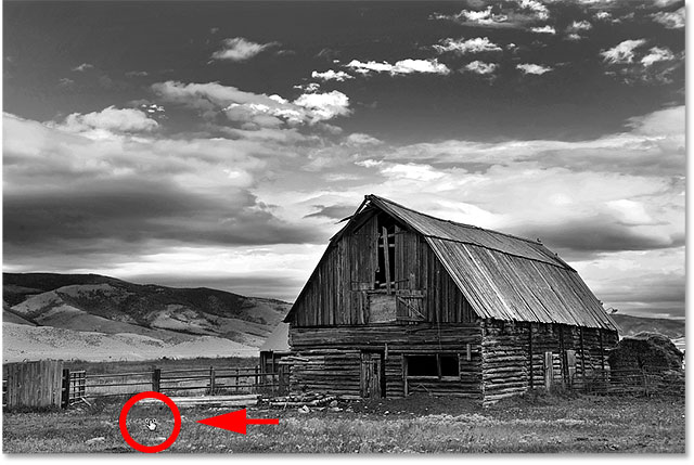
The Targeted Adjustment Tool
As if dragging sliders wasn't easy enough, there's an even easier way to customize your black and white version, and that's by using the Targeted Adjustment Tool. You'll find it directly under the Preset option. Click on the tool to select it:

The Targeted Adjustment Tool lets us target a specific area in the image just by clicking on it. We can then lighten or darken that area by simply dragging left or right on the area itself, rather than dragging the slider.
For example, I think the mountain tops in the background are looking too dark. I know that the main color in that area is blue, so to lighten it, I could drag the Blues slider in the Properties panel. Or, with the Targeted Adjustment Tool selected, I can simply move my mouse cursor over that area in the image. My cursor will temporarily change into the Eyedropper Tool icon. The Eyedropper Tool is what Photoshop uses to sample colors from the image:

I'll click on the image to let Photoshop sample the color from the area, then I'll keep mouse button held down. My cursor changes from the Eyedropper Tool icon back into the Targeted Adjustment Tool icon:
With my mouse button still held down, I can either drag to the left to darken the area, or to the right to lighten it, just like I would do if I was dragging a slider. In my case, I want to lighten the area, so I'll drag to the right. I only need to lighten it a little bit, just enough to bring back some of the detail, so I'll drag a short distance:

If you keep an eye on the Properties panel as you're dragging with the Targeted Adjustment Tool, you'll notice that the slider for the color you clicked on is moving along with you as you drag. In my case, since the original color of the area was blue, and I'm dragging to the right, the Blues slider moves to the right as well:

Keep in mind, and this applies whether you're dragging the sliders or using the Targeted Adjustment Tool, that when you adjust a certain area, you're not adjusting only that one area. You're adjusting every area in the image which contains that color. In my case, lightening the mountain tops also lightened the sky because both areas contain blue:

Now that I've been looking at the image for a while, I'm thinking it might have been a mistake to lighten the grass in the bottom of the photo. Darkening that area would bring out more detail. Since nothing we do with the Black & White adjustment layer is permanent, it's easy to make changes and try out different ideas.
To darken the grass, I'll click on it with the Targeted Adjustment Tool to sample its color. Then, with my mouse button still held down, I'll simply drag to the left until I'm happy with the result:
Since the area I clicked on with the Targeted Adjustment Tool was yellow, Photoshop moved the Yellows slider in the Properties panel as I dragged:

Finally, I'll lighten the barn by clicking on it with the Targeted Adjustment Tool to sample its color, then I'll keep my mouse button held down as I drag to the right:

Since the main color of the barn was red, Photoshop moved the Reds slider to the right. If you look back at the image, you’ll notice that along with the barn, other areas that also contain lots of red, like the wooden fence, the hay behind the barn and some areas of the grass, were also lightened:

Comparing The Results
In a moment, we'll learn how to easily bring back some of the color from the original image. But now that we've created our own custom black and white version using a Black & White adjustment layer, let's quickly compare our result with what we first achieved back at the beginning of the tutorial using a Hue/Saturation adjustment layer.
First, I'll turn off the Black & White adjustment layer by clicking its visibility icon in the Layers panel. Then, I'll click the Hue/Saturation adjustment layer's visibility icon below it to turn that layer on:
And here, we see the original black and white version that we achieved by simply desaturating the color:
To switch back to the custom version, I'll click on the Hue/Saturation layer's visibility icon to turn it off, then I'll click the Black & White layer's visibility icon above it to turn it back on:
And here is my custom version created with the Black & White adjustment layer:

Restoring Some Of The Original Color
At this point, we've learned everything we need to know to turn a full color photograph into a beautiful, custom black and white image. But just because we've converted it to black and white doesn't mean it needs to be entirely black and white. Thanks to the power of adjustment layers in Photoshop, we can easily restore some of the photo's original color.
All we need to do is lower the opacity of the Black & White adjustment layer. You'll find the Opacity option in the upper right of the Layers panel. The default opacity value is 100%, which means that the adjustment layer is completely blocking the original image below it from view. Lower the opacity to around 90%:

This brings back just a hint of the original color, giving us our final result:
