
Colorizing Images With Gradients In Photoshop
In this Photoshop Effects tutorial, we'll learn how to add complex colorizing effects to images using custom gradients! Specifically, we'll look at the Gradient Map image adjustment and how it allows us to apply different colors to different brightness levels in the image. We'll see how easy it is to create our own custom gradients in Photoshop so we can colorize our images with any colors we choose.
As always, we'll be using the adjustment layer version of the Gradient Map so we avoid making any changes to the original photo, and so we can easily adjust the intensity of the effect when we're done!
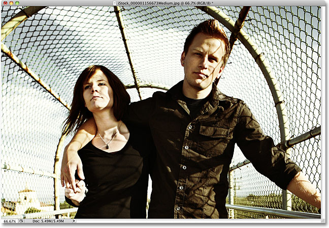
Here's the image I'll be working with:
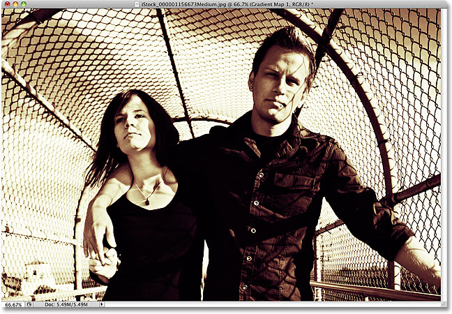
Here's how it will look after colorizing it with a gradient and then reducing the intensity of the effect. This is just one of endless possibilities:
How To Colorize An Image With A Gradient
Step 1: Create A Custom Black And White Version Of The Image
Before we start colorizing the image with a gradient, let's first remove the existing colors and create a custom black and white version. This will help us fine-tune the results at the end. If you're using Photoshop CS3 or higher (I'm using CS4 in this tutorial), the easiest way to create a great looking custom black and white version is with a Black & White adjustment layer, which is what I'll be adding in a moment. If you're using Photoshop CS2 or earlier, use either a Channel Mixer or Hue/Saturation adjustment layer to create your black and white version. You'll find complete details on these and other ways of converting color images to black and white in our Photo Editing section.
If we look in our Layers palette, we see that we currently have only one layer, the Background layer, which is the layer that contains our image. To add a Black & White adjustment layer, click on the New Adjustment Layer icon at the bottom of the Layers palette and choose Black & White from the list of adjustment layers that appears:

As soon as you select the Black & White adjustment layer, you'll see your image in the document window suddenly appear in black and white, based on the default settings for the adjustment. In Photoshop CS3, the controls for the Black and White adjustment layer will open in a dialog box on your screen. In CS4, they'll appear inside the Adjustments Panel, which is new to CS4. In either case, the way it works is the same. Simply drag any of the color sliders (Reds, Yellows, Greens, Cyans, Blues, and Magentas) left or right to brighten or darken areas in the image that originally contained that particular color. Dragging a slider towards the left will darken areas of that color, while dragging to the right will lighten them.
For example, skin tone always contains lots of red, so to lighten someone's skin in the black and white version of the image, simply drag the Reds slider towards the right. Trees and other plants usually contain lots of yellow (even though they appear green to us), so to brighten or darken them, just drag the Yellows slider. Always keep an eye on your image in the document window as you drag the sliders to judge the results:

Once you're happy with the results, click OK to exit out of the dialog box if you're using Photoshop CS3. In CS4, the Adjustments Panel can remain open. Here's my image after converting it to black and white:

If we look in our Layers palette again, we see that we now have two layers. The original image is still sitting on the Background layer, and directly above it is our adjustment layer. The black and white conversion we just applied is contained entirely within the adjustment layer itself. The original image below it remains in full color, untouched and unaffected by anything we just did, which is why we should always use adjustment layers whenever possible:

Step 2: Add A Gradient Map Adjustment Layer
Now that we have our black and white version, we can colorize the image with a gradient. For that, we'll use another adjustment layer, this time a Gradient Map. Click again on the New Adjustment Layer icon at the bottom of the Layers palette and choose Gradient Map from the list:

As with the previous adjustment layer, if you're using Photoshop CS3 (or earlier), the controls for the Gradient Map will open in a dialog box on your screen. In CS4, they appear in the Adjustments Panel.
Step 3: Create A Custom Gradient
By default, Photoshop uses a gradient based on your current Foreground and Background colors, which, unless you've changed them, will be black (Foreground) and white (Background), which gives us a black to white gradient. We can see what the current gradient looks like in the gradient preview area:

Since we want to colorize our image, a black to white gradient won't do us much good, so let's change the colors and create our own custom gradient! Click directly on the gradient preview area, which opens up the larger Gradient Editor. At the top of the Gradient Editor is a series of thumbnails, each one representing a different pre-made gradient (known as a gradient preset) that we can choose simply by clicking on its thumbnail. We're not going to do that though (so don't click on any of them) because we're going to see how easy it is to create a custom gradient.

It wouldn't be called the Gradient Editor if all we could do was choose from pre-made gradients, and in fact, it's very easy to create our own using any colors we want. In the bottom half of the dialog box is a larger version of the gradient preview area we saw a moment ago. Directly below the preview area on either end is a color stop which shows the current color that's being used in that part of the gradient. The color stop on the left is filled with black, while the one on the right is filled with white. To change either color, simply click on the color stop, then click on the rectangular color swatch to the right of the word Color at the bottom of the dialog box.
Let's change the black on the left of the gradient to something else. Click on the black color stop to select it, then click on the color swatch:

This opens Photoshop's Color Picker. For best results, you'll usually want to create gradients that progress from darker colors to lighter colors, so I'll choose a dark purple from the Color Picker, which will replace black in the gradient:

Click OK when you're done to exit out of the Color Picker. If we look at my image in the document window, we see that by replacing black in the gradient with purple, all of the dark areas in the photo now appear purple rather than black:

Let's do the same thing for the white color stop below the far right of the gradient preview area. Click on the color stop to select it, then click on the color swatch to change its color:

When the Color Picker appears, I'll choose a bright yellow to replace white:

Click OK to exit out of the Color Picker, and we can see that the areas in the image that were originally white (or a light shade of gray) now appear yellow:

Adding More Colors
At the moment, our gradient is made up of only two colors, but we can add as many colors we like simply by adding more color stops. To add a color stop, just click below the gradient preview area at the spot where you want it to appear. I'll add a third color stop below the middle of the gradient. As soon as you click, the new color stop appears:

To change its color, simply click on the color swatch, then select a new color from the Color Picker. I'll select a medium orange. Notice that I'm purposely selecting new colors that match, as close as possible anyway, the brightness of the original color in the gradient. You can create wild and crazy color effects by selecting colors with very different brightness levels than the originals, but for smoother, more natural looking gradients, it's best to try and match the brightness levels as closely as possible:

I'll click OK to once again exit out of the Color Picker, and we can see in the document window that the midtones in my image now appear orange. The darker areas are still purple, and the lighter areas are still yellow thanks to the three-color gradient I've created to colorize the image with:

Not only can we add new colors to the gradient, we can move existing colors around. To move any of the colors and change the look of the gradient, simply click on the color stop and drag it left or right along the bottom of the gradient preview area. You can also click and drag the small diamond shape that appears between two color stops to change the distance it takes for one color to blend into another. Keep an eye on the image in the document window to judge the results. Finally, to remove a color from the gradient, just click and drag its color stop away from the gradient preview area until it disappears, then release your mouse button:

When you're done creating and editing the gradient, click OK to exit out of the Gradient Editor, then click OK to exit out of the Gradient Map dialog box (Photoshop CS3 and earlier).
Step 4: Change The Blend Mode Or Lower The Opacity
If you find that the initial colorizing effect is too intense (as mine is), there's a couple of easy ways to give it a more subtle appearance. One is by changing the blend mode of the Gradient Map adjustment layer. I'm going to change my blend mode from Normal (the default blend mode) to Soft Light:
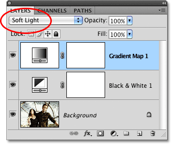
You can also try the Overlay blend mode for a higher contrast look. In my case, Soft Light works better and gives me a much more subdued colorizing effect:
Another way to reduce the intensity of the effect is by lowering the opacity of the Gradient Map adjustment layer. I'll set my blend mode back to Normal and this time, I'll lower the Opacity option (directly across from the blend mode option) all the way down to 25%:

By lowering the opacity of the adjustment layer, we get a softer look with less contrast than what the Soft Light blend mode gave us:
