
Photoshop Black and White Conversions – Color Channels Tutorial
In this sixth tutorial in our series on the many ways of converting color photos to black and white in Photoshop, we're going to take our first look at Photoshop's color channels and how they can help us create convincing black and white versions of our images.
I said "first look" because both this tutorial and the next one will focus on color channels. In this tutorial, we'll learn how to use the Channels palette to view and select a specific color channel which can provide us with a ready-made black and white version.
We'll also see how to quickly improve the tone and contrast of the final image using a simple Levels adjustment. In the next tutorial, we'll combine all three color channels to create a custom black and white version using Photoshop's Channel Mixer.
We won't be getting into a detailed discussion here on how color channels in Photoshop work, but to learn more about them, be sure to check out our RGB and Color Channels Explained tutorial which you'll find in the Digital Photo Essentials section of the website.
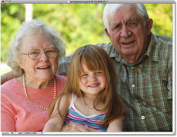
Here's the image I'm using throughout these black and white conversion tutorials, just in case you haven't grown tired of me repeating myself, just in case you haven't grown tired of me repeating myself (sorry, bad joke):
Step 1: Switch Over To The Channels Palette
By default, digital images like the ones captured by your digital camera use the RGB color mode. The term "RGB" stands for Red, Green and Blue, and it means that every color we see in the photo is being made from some combination of red, green and blue, which are the three primary colors of light. Each of these three primary colors is represented in Photoshop as a color channel, and we can view these color channels in the Channels palette, which you'll find grouped in between the Layers and Paths palettes. Click on the name tabs at the top of the palettes to switch between them. The "RGB" channel at the top is simply the image as we see it in the document window with all three color channels combined. The real channels are the Red, Green and Blue channels below it:

Step 2: Select A Specific Channel To Use As The Black And White Image
If you look at the preview thumbnail to the left of each channel's name, you'll notice that each channel is represented by a black and white version of the image, and that the black and white version is different for each channel. The reason they're different is that each black and white version represents how much of that color is being mixed in to create the colors we see in the photo, just like a painter mixes colors to create more colors. Lighter areas in the black and white version mean that more of that color is being mixed in, while darker areas mean less is being used. A blue sky, for example, would use lots of blue and very little, if any, green or red, so the sky in the Blue channel's black and white version would appear much brighter than it would in the Green or Red channels.
We can view each channel separately in the document window simply by clicking on each one in the Channels palette. In fact, we're going to pick one to use as the black and white version of our image! First, let's check out the Red channel's black and white version by clicking on it. The other channels will be deselected and only the Red channel will remain highlighted in blue:

Here's what my Red channel's black and white version looks like in the document window. Notice how light it is (your image may be different), especially in the faces of the three people in the photo, since skin tone always contains lots of red. Remember, the lighter a certain area of the image is, the more of this specific color (in this case, red) is being added:

Next, click on the Green channel in the Channels palette to select it:

The document window now displays the Green channel's black and white version, which is not as bright as what we saw with the Red channel, although the background appears brighter than the people in the foreground due to all the trees. Again, the brightness of your Green channel will depend on your image so it may appear quite different from mine:

Finally, click on the Blue channel in the Channel's palette to select it:

Since there isn't much blue in my photo, the Blue channel's black and white version appears too dark to be of much use to us:

In most cases, especially with portrait photos, it will come down to a choice between the Red and Green channels, but of course the specific image you're working with may give you very different results than what I'm seeing here. Right now, my Green channel seems to give me the best combination of overall tone and detail, and if I didn't have time to make any other edits to the image, I would go with the Green channel's black and white version. However, since I do have time to help the image out a bit more, I'm going to choose the Red channel. I know it looks too light and washed out, but in a moment, we'll see how to quickly improve the tone and contrast of the Red channel's black and white version using a Levels adjustment.
Step 3: Create A New Document From The Channel
Once we've decided on the channel we're going to use for our black and white version, we need to create a brand new Photoshop document from the channel. To do that, Right-click (Win) / Control-click (Mac) directly on the channel in the Channels palette and choose Duplicate Channel from the menu that appears. Here, I'm duplicating the Red channel:

This will open the Duplicate Channel dialog box. In the Destination section of the dialog box, change the Document option to New. This will place the copy of the channel in its own document. Don't worry about naming the document or any of the other options:

Click OK to exit out of the dialog box. The copy of the channel will open inside its own document on your screen:

You can close out of the original photo's document window at this point since we no longer need it. Choose Don't Save if Photoshop asks if you want to save the changes you've made to it.
Step 4: Change The Color Mode To Grayscale
Whenever we delete one or more color channels from an RGB image or copy a channel to a new document, Photoshop automatically converts the image to the Multichannel color mode, useful for creating spot channels for special printing needs. Unfortunately, many of Photoshop's editing features are unavailable to us while the image is in the Multichannel color mode, so let's convert it to a different color mode. Since we're working with a black and white image, we'll convert it to Grayscale.
Go up to the Edit menu at the top of the screen, choose Mode, and then choose Grayscale from the list:

Step 5: Add A Levels Adjustment Layer
With the image now in the Grayscale color mode, let's see if we can quickly improve the overall tone and contrast of our black and white photo using a Levels adjustment layer. Click on the New Adjustment Layer icon at the bottom of the Layers palette and select Levels from the list of adjustment layers that appears:

For a more detailed explanation of how the Levels adjustment works, be sure to check out our Improving Image Tone With Levels tutorial.
Step 6: Adjust The Black, White And Midtone Sliders (If Needed)
If you're using Photoshop CS4 as I am here, the controls for the Levels adjustment layer will appear in the Adjustments Panel, which is new in CS4. If you're using Photoshop CS3 or earlier, the Levels dialog box will open on your screen.
The main feature of the Levels adjustment is the histogram, which shows us the current tonal range of the image. Directly below the histogram are three small sliders - one on either end and one in the middle. The slider below the histogram on the far left is the black point slider. We use the black point slider to adjust the black levels in the image, pulling the darkest pixels closer to pure black. If there's empty space between the left edge of the histogram window and the left edge of the histogram itself, as there is with my histogram, click on the black point slider and drag it towards the right until it's directly below the spot where the left edge of the histogram slope begins:

The slider below the histogram on the far right is the white point slider, which we use to adjust the white levels in the image, pushing the lightest pixels closer to pure white. If there's empty space between the right edge of the histogram window and the right edge of the histogram itself, click on the white point slider and drag it towards the left until it's directly below the spot where the right edge of the histogram slope begins. In my case, the right edge of the histogram is already as far to the right as it can go, which means my white point is already set to its optimal level so there's no need to make any further adjustment:

The slider below the middle of the histogram is the midtone slider, which allows us to adjust the brightness of the midtones in the image (the brightness values between pure black and pure white). If, after moving the black and white point sliders, your photo still appears too light or too dark, drag the midpoint slider left or right to lighten or darken the midtones. Dragging it towards the left will lighten them, while dragging it towards the right will darken them (sort of the exact opposite of what you might expect). In my case, I'm going to drag the midtone slider a little towards the right to darken the image further:

When you're done, click OK to accept your changes and exit out of the Levels dialog box (Photoshop CS3 and earlier only. Photoshop CS4 users can leave the Adjustments Panel open). Here, after improving the tone and contrast of the black and white version I "borrowed" from the Red channel, is my final result:

As we learned in this tutorial, Photoshop's individual color channels each give us a different black and white version of the image. Here, we chose a specific channel to use and in doing so, we tossed the other two channels away. Up next, we'll look at how to mix all three color channels together to create a custom black and white version using Photoshop's Channel Mixer!