
RGB and Color Channels in Photoshop Explained
Did you know that Photoshop is color blind? When I say "color blind", I don't mean it has a little trouble distinguishing between certain shades of green and purple. I mean it's completely and totally blind when it comes to color. All Photoshop sees is black and white. Well, black, white, and a lot of shades of gray in between, but that's it. The world's most powerful image editor, an industry standard among photographers, designers, and virtually all creative professionals, capable of producing millions, even billions of colors, has no idea what color is.
You may be looking at a photo you took on your last vacation of the crystal blue waters on the ocean, but all Photoshop sees is a gray ocean. Did you manage to snap a picture of a rainbow arching across the sky after a summer evening storm? Photoshop sees it as a beautiful assortment of shades of gray. And that famous pot of gold at the end of it? To Photoshop, it's a big ol' pot of gray.
Don't feel sorry for Photoshop though. It's perfectly happy in its colorless world. In fact, the only reason it shows us our images in color at all is because we as human beings expect to see them in color. We wouldn't know what to think if everything was appearing in black and white. But not Photoshop. To it, life just couldn't be sweeter than in black, white and gray.
Alright, so if Photoshop doesn't have a clue what color is, and all it knows and sees is black, white and gray, how does it manage to show our images in color? I mean, here's an image I have open in Photoshop:
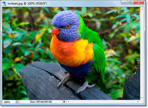
Obviously, this little guy (or girl) is in color. In fact, I don't think birds come much more colorful than this. But it's not just the bird. The leaves in the background are in color. The piece of wood the bird is standing on is in color. The whole thing is in color! And this image is open in Photoshop, so how can it be that Photoshop doesn't see color? And if it really doesn't see color, how is Photoshop doing such a great job of showing us something it doesn't see?
To answer that question, we need to look at a couple of things. One is color modes and the other is color channels. They're both related to each other in a big way, so once you understand the first one, color modes, the second one, color channels, makes a lot more sense.
We know, or at least we'll willing to go along with the idea for the moment, that Photoshop doesn't see color. All it sees is black, white and gray. So how does it take those blacks, whites and grays and translate them into the colors we see on our screen? The answer is, it depends. Depends on what, you ask? It depends on which color mode Photoshop is using.
There's quite a few different color modes out there, but the two main ones are RGB and CMYK. A couple of others you may have heard of while working in Photoshop are Grayscale and Lab (pronounced "L-a-b", not "Lab"). These are all examples of color modes, and they determine how Photoshop translates its black and white information into color, with the exception of the "Grayscale" color mode, which doesn't use color at all. It's strickly a black and white mode, and is often used to quickly convert a color image into black and white.
Of these four that I've mentioned, the one we're going to be looking at here is the first one, RGB. The "CMYK" mode deals with printing and ink and is a whole other topic for another day. The "Grayscale" mode, as I mentioned, is strickly used for black and white images, and the "Lab" mode is beyond the understanding of most people on the planet, as well as a few people on other planets, although it is often used for professional image editing, but even then, most people who use it have no idea how it really works. Which leaves us with "RGB".
By far the most widely used color mode in the world of computers and technology is the "RGB" color mode. Photoshop uses it, other programs on your computer use it, your computer monitor uses it, so does your digital camera and scanner, your television, even the little screen on your cellphone or iPod uses it, as well as those handheld game systems like the Sony PSP or the Nintendo DS. If it's a device that either displays or captures images, or a software program that edits those images like Photoshop, it uses the "RGB" color mode. Sounds pretty important, doesn't it? And it certainly is. Yet for all it's widespread use and technological importance, all "RGB" stands for is the names of three colors - Red, Green and Blue.
RGB And Color Channels: The Colorful World Of Red, Green And Blue
So what's so special about these three colors, red, green and blue? Well, they just happen to be the primary colors of light. And what does that mean? It means that every color you and I can see is made up of some combination of red, green and blue. How do we get yellow? By mixing red and green. How do we get magenta? By mixing red and blue. What about orange? 100% red, 50% green. And these are just basic examples. Every single color that we can see is made up of some combination of these three colors. Sounds almost impossible, I know, but it's true.
When you mix fully saturated versions of all three colors together, you get pure white. When you remove all three colors completely, you get pure black. And when you mix equal amounts of all three colors at some percentage between 0 and 100%, you get a shade of gray.
Let's look at our photo of the bird again:
A very colorful image indeed, but where are all these colors coming from? Well, for starters, let's look at what the information along the top of Photoshop's document window is telling us:

As I've circled in red, Photoshop is telling us that this image is using the "RGB" color mode, which means that every color we're seeing in the photo is being made up of some combination of red, green and blue. If we want proof, all we need to do is hover the mouse over any part of the image and look in Photoshop's Info Palette.
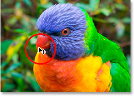
I'm going to hover my mouse near the end of his beak, which is a bright red area:
Let's look at Photoshop's Info Palette to see what it's telling us about that spot in the image:
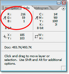
The part of the Info Palette we're interested in is the top left, as I've circled above, which shows us the RGB color values. One thing you need to understand here, and this is really a whole other topic on its own, but Photoshop doesn't list RGB color values as percentages, so we won't see values like "10% red, 40% green and 50% blue". Instead, RGB values are listed as numbers between 0 and 255, with 0 being absolutely no amount of that color in the image and 255 being the color at full strength. So if we look up at the area I've circled, we can see that the area I'm hovering over in the image is being made up of red at a value of 216 (a very high amount), green at 59 (a much smaller amount), and blue at only 1 (might as well be zero), which means there's practically no blue in that area and only a small amount of green. The vast majority of the color is coming from red, which makes sense since the bird's beak is clearly red.
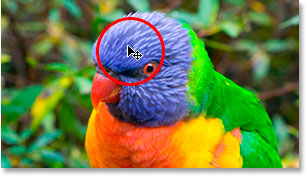
Let's look at another spot. I'll hover my mouse over an area on his back:
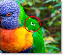
That area looks pretty green to me, and if we look at what the Info palette is telling us:
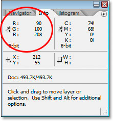
Sure enough, green is by far the predominant color, coming in at a value of 180. The red is only showing up at 20, which is a very small amount, and the blue is even less at 16.
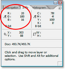
Let's do this one more time. I'll hover the mouse somewhere over the bird's head:
This time, the blue should be making a much stronger showing in the Info Palette:
And sure enough, this time the blue is coming in at a value of 208 and is the predominant color. Of course, the bird's head isn't pure blue. It's more of a purple-blue, which explains why green is still coming in at 100, and even red is making a decent appearance at a value of 90. All three are mixing together on the screen to give us that purple-blue color we're seeing.
I could continue hovering my mouse over any spot in the photo (I won't, but I could) and we'd see the values for red, green and blue changing in the Info palette, since every single color in the image is being made up of some combination of them.
And that's how the RGB color mode works. Again, RGB stands for nothing more difficult than "Red", "Green" and "Blue", and because this image is in the RGB color mode, Photoshop is reproducing every one of the colors using combinations of red, green and blue.
Color Channels
So far, we've learned that Photoshop doesn't see color. Everything in Photoshop's world is made up of black, white, or some shade of gray. We've also learned that Photoshop uses the RGB color mode to display colors on the screen by mixing different combinations of red, green and blue. But how does Photoshop know how much red, green and blue to mix together for each color on the screen when it doesn't see colors to begin with? I mean, it's great that Photoshop can display pure yellow by mixing red at a full strength value of 255 with green also at 255, but how does it know to display yellow in the first place?
The answer is, it doesn't.
Huh? It doesn't?
Nope, it doesn't. Photoshop doesn't know that you're expecting to see yellow in a certain part of the image. All it knows is that it's supposed to display red at 255 and green at 255, and to leave blue out of it. If that makes a certain color that you and I call "yellow", great, but really, Photoshop couldn't care less. All it knows is "display red at 255, green at 255, and blue at 0 in that specific pixel". Whatever color that ends up being to you and I matters not to Photoshop. When adding colors to images, Photoshop is strictly a "paint by numbers" artist.
Alright then, so all Photoshop knows is to add a certain amount of red, green and blue. But how does it know how much of each color to add when all it understands is a world of black, white and gray? Two words... Color Channels.
Let's look at our bird photo once again:
That's how you and I see the image.This is how Photoshop sees it:
But wait, there's more. This is also how Photoshop sees it:
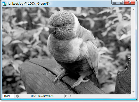
But how can it be seeing it in two different black and white versions? Good question. The answer is, it doesn't. It sees it in three different black and white versions. Here's the third one:
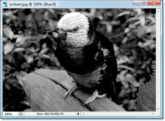
What we see as one full color image, Photoshop sees as three separate black and white images. Each one of those images represents a color channel. The first one was the red channel, the second one was the green channel, and the third was the blue channel. Three separate channels for three separate colors, all coming together to create the full color image.
Think of color "channels" as color "filters". Whenever Photoshop displays a color image on the screen, it knows which colors to display by shining a light through the filters. First it shines the light through the red filter (the red channel). If no amount of light passes through the filter, Photoshop knows to display red at a value of 0. If all of the light passes through the filter, Photoshop displays red at a full strength value of 255. If some lesser amount of light passes through, Photoshop displays red at a value somewhere between 0 and 255 depending on how much light passed through.
Then it does the same thing with the green filter (the green channel), assigning green a value of 0 if no light passes through, 255 if all the light passes through, and some value in between if some but not all of the light passes through. Then it does it with the blue filter (the blue channel). When it's done, it knows what value to set for red, green and blue, and it combines them to create the color we see. It does this for every single pixel in your image, so if your image contains millions of pixels, as most photos from digital cameras these days do, Photoshop goes through this process millions of times just to display the image you see on your screen. See how much Photoshop loves you? Okay, so a moment ago I said Photoshop couldn't care less. Let's just move on.
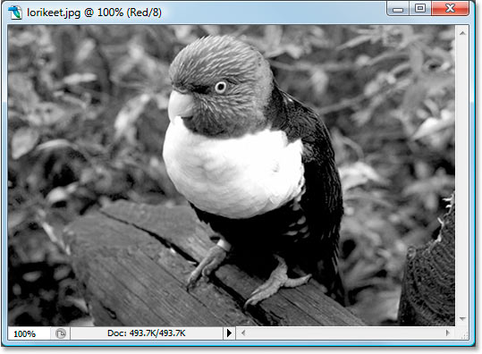
The "filters" Photoshop uses are those three separate black and white images we saw on the previous page. Let's look again at the red one:
Okay, so how does Photoshop manage to use this black and white image as a red filter? Remember how I said that Photoshop assigns a value between 0 - 255 to red based on how much light passes through the filter? Well, how much light is able to pass through the filter all depends on how bright or dark that part of the black and white image is. Any areas that are pure black don't allow any light to pass through, which means that red will be set to 0 in those parts of the image. Any areas that are pure white allow the full amount of light to pass through, so red will be set to 255 in those areas. And areas that are some shade of gray, which usually make up most of the image, will allow varying amounts of light through depending on how light or dark the shade of gray is. In the image above, we can see that the brightest parts of the image are the bird's beak and chest, which based on what I just said should mean that those areas contain a lot of red in the full color version. Likewise, his back, wing and belly are very dark, so those areas shouldn't have much red in them at all, if any.
Let's look again at the full color version:
We said the beak and chest should contain lots of red, and sure enough, they do! We also said the back, wing and belly should appear to have very little if any red, and they sure don't look red to me.
Let's look again at the black and white image Photoshop is using for the green channel:
This black and white image contains a lot of lighter areas, which means there should be a lot of green in this photo. Oddly enough, one of the brightest areas in the image is along the sides of the bird's chest, and I don't remember that being green. Let's check this out by looking at the full color version again:
There certainly is a lot of green in the image, which explains why the black and white image had so many lighter shades of gray. If I look at the side of the bird's chest though, which was one of the lightest areas in the black and white image, it doesn't look green at all. In fact, it's very much yellow! How is that possible? Simple. Red and green combined make yellow, so in order to display yellow, Photoshop has to mix red and green together.
This image has a lot of very dark areas, especially in the bird itself, with the exception of the bird's head which is very bright. This should mean that the only part of the bird that should appear blue is its head, although its belly should also have a noticeable amount of blue, as well as its feet and the piece of wood it's standing on. Let's take a look:
Sure enough, the bird's head is very much blue, and we can also see blue in its belly, as well as its feet and the piece of wood. The rest of the bird has no noticeable blue areas, which is why it appeared so dark in the black and white image.
And that just about wraps up our look at how the RGB color mode and color channels work inside Photoshop, except for one thing. We still haven't seen where you can access these color channels. You'll find them in the appropriately-named Channels palette, which is grouped in with the Layers palette:
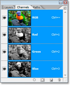
The Channels palette looks a lot like the Layers palette, except that it shows color channel information instead of layers. You can see that there's one for Red, one for Green and one for Blue, and each one contains it's own separate black and white version of the image, just as I've shown in this tutorial. The channel at the very top, "RGB", isn't really a channel at all. It's just the composite of all three channels, giving us the full color photo. You can click on any of the channels individually in the Channels palette to display that channel's black and white image in the document window.
And there we have it. We now know that Photoshop sees everything in terms of black, white and gray. We know that it uses the RGB color mode (by default anyway) to mix varying amounts of red, green and blue to create what we see as the full color image on our screen. And we know that it determines how much red, green and blue to use by looking at the black and white version of the image in each of the three color channels, and that it does this for every single one of the millions of pixels in the image, all so that you and I can see a full color version when Photoshop was perfectly happy with it in black and white.
And that's how we know that Photoshop loves us. We'll end it there.