
The Benefits Of Working With 16-Bit Images In Photoshop
Digital cameras, or at least high-end digital cameras, have been able to shoot in the raw format for several years now, enabling you to open your images in Photoshop and edit them in 16-bit mode rather than the 8-bit mode you get with standard JPEG images.
Yet many photographers, even pro photographers, are still shooting in the JPEG format even when their camera supports raw. And although there are a few valid reasons for choosing JPEG over raw, with faster speed and much smaller file sizes being the two that instantly come to mind, many people are still shooting in JPEG simply because they don't understand the benefits of being able to edit their images in 16-bit. We're going to look at those benefits in this tutorial.
What Does The Term "8-Bit" Mean?
You may have heard the terms 8-bit and 16-bit before, but what do they mean? Whenever you take a picture with a digital camera and save it in the JPEG format, you're creating a standard "8-bit" image. The JPEG format has been around for a long time and as digital photography and even Photoshop itself continue to advance, the limitations of the JPEG format are becoming more and more apparent. For one thing, there's no way to save a JPEG file as 16-bit because the format doesn't support 16-bit. If it's a JPEG image (with the extension ".jpg"), it's an 8-bit image. But what does that mean, "8-bit"?
If you read our tutorial RGB and Color Channels Explained, you know that every color in a digital image is made up of some combination of the three primary colors of light - red, green and blue:
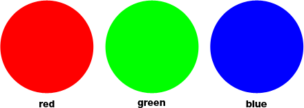
It doesn't matter what color you're looking at on your screen. It's being made up of some combination of those three colors. You may be thinking, "That's impossible! There's millions of colors in my image. How can you create millions of colors out of just red, green and blue?"
Good question. The answer is, by using multiple shades of red, green and blue! The more shades of each color you have to work with and mix together, the more colors you can create. If all you had was pure red, pure green, and pure blue, the most you could create would be seven different colors, including white if you mixed all three together:
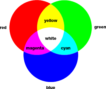
You could also include an eigth color in there as well, black, which you would get if you completely removed red, green, and blue.
But what if you had, say, 256 shades of red, 256 shades of green, and 256 shades of blue? If you do the the math, 256 times 256 times 256 equals roughly 16.8 million. That's 16.8 million colors you can now create! And that's exactly what you get with an 8-bit image - 256 shades of red, 256 shades of green, and 256 shades of blue, giving you the millions of possible colors you usually see in a digital photo:

Where does the number 256 come from? Well, 1-bit equals 2. When you move beyond 1-bit, you find its value using the expression "2 to the exponent (however many bits there are)". So, for example, to find the value of 2-bits, you would calculate "2 to the exponent 2", or "2 x 2", which equals 4. So 2-bits equals 4.
A 4-bit image would be "2 to the exponent 4", or "2 x 2 x 2 x 2", which gives us 16. So 4-bits equals 16.
We do the same thing for an 8-bit image, which would be "2 to the exponent 8", or "2 x 2 x 2 x 2 x 2 x 2 x 2 x 2", which gives us 256. That's where the number 256 comes from.
Don't worry if you found that confusing, or even worse, boring. It all has to do with how computers work. Just remember that when you save an image as a JPEG, you're saving it as an 8-bit image, which gives you 256 shades each of red, green, and blue, for a total of 16.8 million possible colors.
Now, 16.8 million colors may seem like a lot. But as they say, nothing is big or small except by comparison, and when you compare it with how many possible colors we can have in a 16-bit image, well, as they also sometimes say, you ain't seen nothin' yet.
As we just learned, saving a photo as a JPEG creates an 8-bit image, which gives us 16.8 million possible colors in our image.
That may seem like a lot, and it is when you consider that the human eye can't even see that many colors. We're capable of distinguishing between a few million colors at best, with some estimates reaching as high as 10 million, but certainly not 16.8 million. So even with 8-bit JPEG images, we're already dealing with more colors than we can see. Why, then, would we need more colors? Why isn't 8-bit good enough? We'll get to that in a moment, but first, let's look at the difference between 8-bit and 16-bit images.
Earlier, we learned that 8-bit images give us 256 shades each of red, green and blue, and we got that number using the expression "2 to the exponent 8", or "2 x 2 x 2 x 2 x 2 x 2 x 2 x 2", which equals 256. We can do the same thing to figure out how many colors we can have in a 16-bit image. All we need to do is calculate the expression "2 to the exponent 16", or "2 x 2 x 2 x 2 x 2 x 2 x 2 x 2 x 2 x 2 x 2 x 2 x 2 x 2 x 2 x 2", which, if you don't have a calculator handy, gives us 65,536. That means that when working with 16-bit images, we have 65,536 shades of red, 65,536 shades of green, and 65,536 shades of blue. Forget about 16.8 million! 65,536 x 65,536 x 65,536 gives us an incredible 281 trillion possible colors!
Now, you may be thinking "Gee, that's great and all, but you just finished saying that we can't even see the full 16.8 million colors that an 8-bit image can give us, so does it really matter than 16-bit images give us trillions more colors we can't see?"
When it comes to editing our images in Photoshop, it most certainly does matter. Let's see why.
Editing In 16-Bit Mode
If you had two identical photos open on your screen in Photoshop, the only difference being that one version was in 16-bit mode with its trillions of possible colors and the other was in 8-bit mode with its 16.8 million possible colors, you might think that the 16-bit version would look better, since it's capable of displaying far more colors than the 8-bit version.
But the simple fact is, most photos don't need 16.8 million colors, let alone trillions of colors, to accurately reproduce their contents. They usually contain several hundred thousand colors at best, although some may reach into the low millions depending on their subject (and depending on the size of the photo as well, since you would need millions of pixels in order to see millions of different colors). Plus, as we've already learned, the human eye can't see 16.8 million colors anyway, which means that when placed side by side, an 8-bit version and a 16-bit version of an identical image will look identical to us.
So why, then, would it be better to work with a 16-bit image? One word - flexibility. When you're editing an image in Photoshop, sooner or later, if you continue making edits, you're going to run into problems. The most common problem is what's known as "banding", where you've lost so much detail in the image that Photoshop can no longer display smooth transitions from one color to the next. Instead, you get an ugly stair-stepping effect between colors and tonal values.
Let me show you what I mean. Here's a couple of simple black-to-white gradients that I've created in Photoshop. Both gradients are identical. The first one was created as an 8-bit image. You can see the number "8" circled in red at the top of the Document Window which tells us that it's currently in 8-bit mode:

And here's the exact same gradient created as a 16-bit image. Other than the fact this this one says "16" at the top of the Document Window to indicate that it's in 16-bit mode, both gradients look the same:

Watch what happens to them though when I edit them. I'm going to perform the exact same edit on both. First, I'm going to press Ctrl+L (Win) / Command+L (Mac) to bring up Photoshop's Levels adjustment, and without getting into a lengthy discussion of how Levels works, I'm just going to drag the bottom black and white "Output" sliders in towards the center. Again, I'm going to do this with both gradients:

What I'm essentially doing here is taking the entire range of the gradients from pure black on the left to pure white on the right and squishing them into a very small section in the center which is normally where you'd find the mid-range grays. I haven't actually changed the gradients. I've just forced their entire tonal range into a much smaller space.
I'll click OK to exit out of the Levels dialog box, and now let's take a look at our two gradients again. Here's the 8-bit gradient:

And here's the 16-bit gradient:

Both gradients now look more like solid gray after the Levels adjustment, but they also still look identical at this point, even though the top one is in 8-bit mode and the bottom one is in 16-bit mode. Watch what happens though when I use Levels again to stretch the tonal range of the gradients back to pure black on the left and pure white on the right. I'm going to drag the black and white "Input" sliders in the Levels dialog box in towards the center this time to force the darkest parts of the gradients back to pure black on the left and the lightest parts back to pure white on the right:

Let's look at our two gradients again. First, the 8-bit gradient:

Ouch! Our smooth black to white gradient doesn't look so smooth anymore! Instead, it has that "banding" or "stair-stepping" effect I mentioned, where you can very easily see where one shade of gray changes to the next, and that's because we've lost huge chunks of detail in the image after making those edits with the Levels adjustment. So the 8-bit image didn't survive very well at all. Let's see what happened to our 16-bit gradient:

Look at that! Even after the rather drastic edits I made with Levels, the 16-bit gradient survived without a scratch! Why is that? Why did the 8-bit gradient end up losing so much detail while the 16-bit gradient did not? The answer goes back to what we've been talking about up till now. An 8-bit image can only contain a maximum of 256 shades of gray, while a 16-bit image can contain up to 65,536 shades of gray. Even though both gradients looked identical to us when we started, those 16 thousand plus extra possible shades of gray gave us a lot more flexibility with our edits and made it far less likely that we would see any problems in the image afterwards. Of course, even with 16-bit images, there could eventually come a point where you've lost enough detail that you can see problems if you're performing a ton of edits on an image, but with 8-bit images, that point will come much sooner, and with 16-bit images, we're talking much, much later.
Editing Photos In 16-Bit Mode
Let's try the same editing experiment on a full color photo. I'll use the photo of the beach ball that we saw on the first page. Here's the image in standard 8-bit mode. Again we can see the "8" at the top of the Document Window:

And here's the exact same photo but in 16-bit mode:

Both images look identical at this point, just as the two gradients did.
The only difference between them is that the top one is an 8-bit image and the bottom is a 16-bit image. Let's try the exact same edit with the Levels adjustment. Now, I realize this edit is a bit extreme and isn't likely to be something you'd actually do to your images. But it does give us a clear example of how much damage we can do to our images when editing 8-bit versions of them compared with how little, if any, damage we do with 16-bit versions.
I'm going to press Ctrl+L (Win) / Command+L (Mac) once again to bring up Photoshop's Levels adjustment dialog box, and I'm going to move the black and white "Output" sliders at the bottom in towards the center, to the same points I used for the gradients. Again, I'm doing this for both the 8-bit and 16-bit versions of the image:

Here's how the 8-bit version of the image looks after forcing its entire tonal range into a small space where you'd normally find just the mid-tone information:

And here's how the 16-bit version of the image looks:

Once again, the two versions are identical. There's no visible advantage with the 16-bit version over the 8-bit version.
Now let's bring up Levels again and stretch the tonal information back to the way it was originally, with the darkest areas becoming pure black and the lightest areas becoming pure white:

Now let's see if there's any advantage with the 16-bit version over the 8-bit version. First, the 8-bit version:

Yikes! Just as with the gradient, the 8-bit version of the image suffered quite a lot of damage thanks to the edit. There is very noticeable color banding, especially in the water, which now looks more like some sort of painting effect than a full color photo. You can also see banding in the beach ball itself, and in the sand at the bottom of the photo. At this point, the 8-bit image is of little use to us anymore.
Let's see how the 16-bit version did:

Once again, just as with the gradient, the 16-bit version survived without a scratch! It looks every bit as good as it did before the edit, while the 8-bit version lost a ton of detail. And it's all because the 16-bit version has such a tremendous amount of possible colors available at its disposal. Even after an edit as drastic as the one I performed, I was unable to make the slightest dent in the quality of the image thanks to it being in 16-bit mode.
So how can you take advantage of 16-bit with your own photos? Simple. Shoot your photos in the raw format instead of JPEG whenever possible (assuming of course that your camera supports raw), then open and edit them in Photoshop as 16-bit images. Keep in mind though that when working with 16-bit images, the file size is much larger than you'd have with an 8-bit image, and if you have an older computer, it could have an impact on how long it takes you to work in Photoshop. Also, although each new version of Photoshop gets better and better with this, not every filter and adjustment is available to us in 16-bit mode, but most of the commonly used ones are.
If you find that you do need to switch to 8-bit at some point because your computer is running too slow or the filter you want to use is unavailable, you can switch to 8-bit mode by going up to the Image menu at the top of the screen, choosing Mode, and then choosing 8 Bits/Channel. Try to work in 16-bit mode for as long as possible though before switching to 8-bit mode.
Also, make sure you switch to 8-bit mode before printing the image, or even better, save your 16-bit version as a Photoshop .PSD file and then save a separate 8-bit version for printing.