
Photoshop’s Levels Image Adjustment Essentials
So far in this series on tone and color correction in Photoshop, we've looked at the three most basic and fully-automatic image adjustments, Auto Tone, Auto Contrast and Auto Color. We then took things up a notch by learning how to improve the overall brightness and contrast of an image with the aptly-named Brightness/Contrast command, and we learned how to restore hidden detail in photos that suffer from too much contrast using a Shadows/Highlights adjustment.
While each of these image adjustments has its place, one downside they all share is that they lack the sort of precise control we need for professional-level image correction. Sure, Brightness/Contrast and Shadows/Highlights are powerful, and even Auto Tone, Auto Contrast and Auto Color can produce great results with the right images. But the truth is, there's nothing we can achieve with any of those adjustments that we couldn't achieve on our own with even better, more professional tools.
We've already taken our first step towards professional-level image correction by learning how to read and understand image histograms, and I highly recommend you read through that tutorial before you continue. Histograms show us where the current tonal range of our image falls between pure black and pure white, making it easy to spot potential problems such as poor overall contrast or shadow and highlight clipping. In this tutorial, we'll take what we've learned about histograms and see how to easily improve the tonal range of an image using a Levels adjustment in Photoshop!
To get a good sense of how the Levels adjustment works, rather than jumping in and correcting an actual image, let's start with something more simple; we'll "correct" a black-to-white gradient. I know, it sounds crazy, but the gradient will make it easy for us to see what's happening as we make adjustments in the Levels dialog box. Once we've covered the details of how Levels works, we'll look at a real world example of how Levels can be used to quickly improve contrast and restore shadow and highlight detail in a photograph.
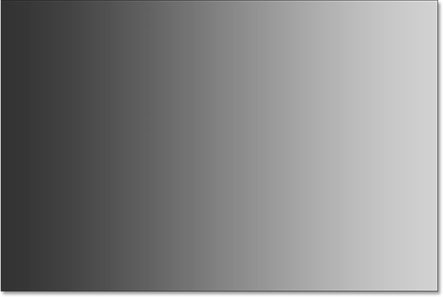
Here's the gradient I have open in Photoshop. Imagine that this is supposed to be a black-to-white gradient. In other words, it should start with pure black on the far left and gradually transition to pure white on the far right. But that's not what we're seeing. Instead of black on the left, we have a lighter shade of gray. And instead of white on the right, we have a darker (than white) shade of gray. Without any true blacks or whites, the gradient appears faded and dull, resulting in poor contrast. Even though we're looking at a simple gradient here, this is a common problem that many photos suffer from, whether it's because the image was under or over-exposed or because it's an older photograph that has faded over time. It's also exactly the type of problem that Photoshop's Levels adjustment was designed to correct:
There's a few different ways that we can apply Levels to an image. The simplest, and the way we'll be using here, is to apply Levels as a static adjustment; that is, applying it directly to the layer itself. Another way we can apply Levels is as an adjustment layer which has the advantages of being both fully-editable and non-destructive. And, new in Photoshop CC 2015, we can now apply Levels (and any of Photoshop's other image adjustments) as an editable Smart Filter! We'll learn how to apply Levels as an adjustment layer and a Smart Filter in the next tutorials. For now, our focus is on how Levels works, so we'll keep things simple and apply it as a normal, static adjustment.
If we look in my Layers panel, we see that my gradient is sitting on the Background layer, currently the only layer I have in my document:

Since we're going to apply Levels directly to the layer itself, which makes permanent changes to the pixels in the image, the first thing we should do is make a copy of the Background layer. That way, we'll be able to work on the copy without affecting the original image. To make a copy of the layer, I'll go up to the Layer menu in the Menu Bar along the top of the screen, choose New, and then choose Layer Via Copy. I could also select the same New Layer Via Copy command directly from my keyboard by pressing Ctrl+J (Win) / Command+J (Mac). Either way works:

Photoshop makes a copy of the layer, names it "Layer 1" and places it above the original:

While I'm at it, I'm going to rename the new layer by double-clicking directly on its name to highlight it. Since we'll be applying a Levels adjustment to this layer, I'll change its name from "Layer 1" to "Levels". To accept the name change, I'll press Enter (Win) / Return (Mac) on my keyboard:

Selecting A Levels Image Adjustment
Now that we'll be working on a copy of the image, we can safely apply a Levels adjustment. To select Levels, I'll go up to the Image menu at the top of the screen, choose Adjustments, and then choose Levels:

This opens Photoshop's Levels dialog box, the same dialog box we used in the previous tutorials to help us better understand how image histograms work:

Evaluating The Histogram
Just to quickly recap, the histogram is the black graph that looks like a mountain range in the center of the dialog box, and it's showing us where and how the current tonal range of the image (in my case, the gradient) is distributed between black and white. If you look below the histogram, you'll see a black-to-white gradient bar. This bar shows us the complete range of possible brightness (tonal) values that the image can contain, from black on the far left to right on the far right. There's 256 possible brightness values in total, including black and white (with 254 levels in between).
Where the histogram appears directly above a brightness level in the gradient bar below it, it means we have pixels in the image at that exact brightness level. Our eyes see differences between brightness levels as detail in the image, so in general, the more brightness levels we have, the more detailed the image appears. Histograms don't represent the actual number of pixels in the image (since most images these days contain millions of pixels, which would make the histogram too large to fit on the screen). Instead, they simply give us a general overview of how many pixels in the image are at a certain brightness level in comparison with other brightness levels. The higher the histogram appears at a certain level, the greater the number of pixels we have at that brightness level. If no part of the histogram appears at a certain brightness level, it means we currently have no pixels in the image at that level.
Let's take a closer look at what my histogram is telling us about the gradient. In a "typical" photo, what we'd usually like to see is a histogram that stretches all the way from pure black on the far left to pure white on the far right. That's usually a sign that the image was well-exposed with lots of detail across the entire tonal range (shadows, midtones and highlights). Now, that's not always the case, as we learned when we looked at examples of low-key and high-key images, but it's still a useful, general guideline.
Unfortunately, that's not at all what we're seeing here. Rather than stretching across the entire tonal range from left to right, my histogram appears all bunched up in the middle. Notice that the left side of the histogram, which represents the darkest pixels in the image, doesn't start at the far left. In fact, it doesn't even come close. If we take that left edge and follow it straight down to the gradient bar below it, we see that the left side actually starts over a lighter shade of gray. This is telling us that we currently have no deep, dark blacks at all in the image. The darkest pixels are lighter than black:

Over on the other side, we see that the right side of the histogram doesn't start at the far right (or anywhere close to it). Instead, if we follow that right edge straight down to the gradient below it, we see that it starts over a darker shade of gray, telling us that there are currently no bright white highlights in the image. The lightest pixels are darker than white:

Now that we've examined the histogram, if we look at my image (the gradient) again, we know that the reason it's not appearing as a black-to-white gradient at the moment is because, as the histogram showed us, we don't have any black or white pixels in the image. The darkest pixels are currently lighter than black, and the brightest pixels are currently darker than white, resulting in poor overall contrast. Fortunately, as we're about to see, the Levels adjustment makes problems like this easy to fix:
Adjusting The Shadows With The Black Point Slider
How can we improve the tonal range using Levels? If you look directly below the histogram "box" (that window the histogram appears in), you'll see three little icons. There's a black one on the far left, a white one on the far right, and a gray one in the middle. These icons are actually sliders, and each one represents a different part of the tonal range. The one on the left is the black point slider. It's used to set a new black point for the image. The one on the right is the white point slider, and it's used to set a new white point for the image. The one in the middle is technically known as the gamma slider but it's easier just to think of it as the midtone slider. It's used to lighten or darken the midtones:

Let's start with the black point slider on the left. As I mentioned, this slider is used to set a new black point for the image, but what does that mean? Well, we know that the left edge of the histogram shows us how dark the darkest pixels currently are in the image, and my histogram is telling us that the darkest pixels, which should be black, are not even close to black. There's a large gap between the left edge of the histogram box and the left edge of the histogram itself, and that empty space means we're missing detail in those tones:

What we need is a way to close up that gap. In other words, we need to take the darkest pixels in the image, at whatever their current brightness level is, and drag them all the way down to black, and we can do that easily using the black point slider. All we need to do is click on the black point slider and drag it over to where the left edge of the histogram begins:

You'll notice that as you drag the black point slider towards the right, the number in the box below it (the box on the left, which represents the current black point value) increases. It starts at 0, which is the default tonal value for black, and in my case, by the time I reached the left edge of the histogram, the number had increased to 50. This means that before I made any adjustments, the darkest pixels in my image were no darker than brightness level 50. There were no pixels at all at brightness levels 0 through 49, which means we were missing the 50 darkest possible tonal values! By dragging the black point slider to level 50, what we're saying to Photoshop is, "Take all the pixels in the image that were originally at brightness level 50 and darken them to pure black". In other words, darken them to level 0. This is what we mean by "setting a new black point". In this case, we're saying that any pixels at or below a brightness level of 50 should now be black:

Let's take a look at my gradient to see what's happened. Notice that the left side is now actually black rather than a lighter shade of gray. Any pixels that were originally level 50 have been darkened all the way down to level 0. Notice also that the change did not only affect the pixels that were at level 50. Photoshop went ahead and redistributed the other tonal values as well to keep the transitions between brightness levels as smooth as possible. Thanks to that one simple adjustment with the black point slider, we now have lots of shadow detail:

Adjusting The Highlights With The White Point Slider
The white point slider below the far right of the histogram box works the same way, except that it lets us set a new white point for the image. My histogram is showing a large gap between the right side of the histogram box and the right edge of the histogram itself, so we know that we're missing a lot of detail in the highlights. The brightest pixels are not even close to being pure white:

To fix that, all we need to do is click on the white point slider and drag it over to where the right edge of the histogram begins:

You'll notice that as you drag the white point slider towards the left, the number in the box below it (the box on the right, which represents the current white point value) decreases. It starts at 255 (the default value for white), and by the time I reached the right edge of the histogram, the number had decreased to 210. This means that the brightest pixels in my image were no lighter than level 210. There were no pixels at all at brightness levels 211 through 255, which means we were missing the 45 brightest possible tonal values! By dragging the white point slider to level 210, we're telling Photoshop, "Take all the pixels that were originally at brightness level 210 and lighten them to pure white". In other words, lighten them to level 255. This is what "setting a new white point" means. We’re saying that any pixels at or above a brightness level of, in this case 210, should now be white:

If we look again at my gradient, we see that the right side is now nice and bright. Photoshop took all the pixels that were originally at level 210 and made them white. And just as it did with the black point, it redistributed the other tonal values for us, keeping the transitions between levels nice and smooth. By simply dragging the black and white point sliders in towards the edges of the histogram, we've corrected the tonal range, boosting contrast and giving us a true black-to-white gradient:

Adjusting The Midtones With The Midtone Slider
You'll often find that once you've set your new black and white points, the image now looks either too dark or too light and washed out. That's because adjusting the black and white points usually affects the midtones in the image as well. To fix that, all we need to do is drag the midtone slider (the gray slider in the middle, also known as the gamma slider). In the case of my gradient, we're not really seeing a problem with the midtones, but we can still use it to help us get a sense of what effect the midtone slider has on an image.
The midtone slider is just as easy to use as the other two sliders, but it works a bit differently. It also behaves opposite to what you might expect which can lead to some confusion. Unlike the black point and white point sliders which allow us to set specific tonal values for the new black and white points (in my case, I set my black point to level 50 and my white point to level 210), the midtone slider does not work with actual tonal values. This is the main reason why many Photoshop users are confused by it. Let's take a closer look.
The box directly below the midtone slider represents its current value. Notice that its default value is 1.00. Right away, something seems different here. I mean, what's with the decimal? The other two values don't have decimals. How can a brightness value have a decimal?

Also, if there's 256 possible brightness values in a histogram, with black at 0 on one end and white at 255 on the other, how does it make sense that the midtone value (that is, the value directly between black and white) would be 1.00? Shouldn't it be something closer to 128? The answer is yes, it should be something closer to 128, if the number represented an actual tonal value. But it doesn't. The number in the box is actually an exponent (think math, as in "2 to the power of 8"). And rather than setting a specific tonal value like we did with the black point and white point, dragging the midtone slider adjusts what's known as the gamma curve (which is why the technical name for the midtone slider is the gamma slider).
Don't worry, there's no need for us to dust off our math books or get into a detailed explanation of gamma curves. You don't need to know anything technical to use Levels. All we really need to know to avoid confusion is that the number in the midtone box does not represent an actual brightness level.
So if it's not a brightness level, how do we use it? The simplest way to think of the midtone value is that, at its default of 1.00, we're not making any changes at all to the midtone brightness. Any value above 1.00 will increase the brightness of the midtones. The higher the value, the brighter they'll appear. Any value below 1.00 will darken the midtones. The lower the value, the darker they'll appear. One important note is that the midtone slider has no effect on the black point and white point. It only affects the brightness of the tones in between.
To show you what I mean, I'll click on the midtone slider and drag it towards the left, increasing its value from 1.00 to 1.50:

By dragging the slider to the left and increasing the midtone value, I've brightened the midtones in the image (or in this case, the gradient). Here, we can see a "before and after" comparison. The bottom half of the image is the original gradient, before any adjustments were made to the midtones. The top half shows the result after dragging the midtone slider to the left. Notice that the black and white areas on either end haven't changed. The midtone slider had no effect on the black and white point values I set earlier. However, the tones in between black and white now appear lighter than they did originally:

I mentioned earlier that the midtone slider behaves opposite to what you might expect. You may think that dragging the midtone slider towards the left, which moves it closer to black, would darken the midtones. After all, we don't normally think of black when trying to lighten something. But, as we've just seen, it does the opposite. Dragging the midtone slider towards black increases the midtone value, and increasing the midtone value causes the midtones to become brighter, not darker.
This time, I'll drag the midtone slider towards the right, which lowers the midtone value. I'll drag it down to 0.50:

And here's the "before and after" comparison of what's happened. The original gradient (without any midtone adjustments) is on the bottom and the adjusted version is on the top. Once again, the midtone slider had no effect on the black and white points, but the tones in between now appear darker. Again, this seems like the opposite of what you might expect. Dragging the midtone slider towards white feels like it should be lightening the midtones, when in fact, it darkens them. It's easy to get things mixed up with the midtone slider, so if you ever find yourself dragging it in the wrong direction, just stop, drag it in the opposite direction and say to the person looking over your shoulder, "Just checking to see if you're paying attention":

A Real World Example
Now that we've covered the details of how Photoshop's Levels adjustment works, let's take everything we've learned and use it to quickly improve the tonal range of an image. Here's an old photo I've scanned into Photoshop. The image has faded over time and is now suffering from low contrast due to a lack of any real shadows or highlights. Even though I'll be correcting a black and white image here, you can use the exact same steps with full color images:

Step 1: Duplicate The Background Layer
Here, we see the photo sitting on the Background layer in the Layers panel:

Using the same steps we covered earlier, since I'll be applying Levels as a static adjustment, the first thing I'll do is make a copy of the Background layer. To make the copy, I can either go up to the Layer menu at the top of the screen, choose New, then choose Layer Via Copy, or I can use the faster keyboard shortcut, Ctrl+J (Win) / Command+J (Mac). Photoshop makes the copy, names it "Layer 1" and places it above the Background layer:

Since it's always good to give layers descriptive names, I'll quickly double-click on the new layer's name ("Layer 1") and change it to "Levels". To accept the name change, I'll press Enter (Win) / Return (Mac) on my keyboard. We now have our copy of the image to work on so we're not making changes to the original:

Step 2: Add A Levels Image Adjustment
To add a Levels adjustment, I'll go up to the Image menu, choose Adjustments, and then choose Levels. I could also select Levels directly from the keyboard by pressing Ctrl+L (Win) / Command+L (Mac). Either way opens the Levels dialog box:

Step 3: Evaluate The Histogram
I'll zoom in on the histogram, and just like with the gradient we looked at earlier, this histogram is showing us that we currently have no black or white pixels in the image. The left side of the gradient starts at a lighter (than black) shade of gray and the right side starts at a darker (than white) shade of gray. We have no detail at all in the darkest and lightest tones, which explains why the photo is lacking contrast:

Step 4: Drag The Black Point Slider
As we've learned, there's three simple steps to correcting this image. First, we set a new black point. Second, we set a new white point. And third, we lighten or darken the midtones as needed. I'll start with the black point by clicking on the black point slider and dragging it over to where the left edge of the histogram begins. Notice that the black point value in the box on the left increases from 0 to a level of 42. This means Photoshop is going to take all the pixels that were originally at brightness level 42 and darken them to level 0, making them black:

Here's the photo after setting the new black point. Already, things are looking better with deep, dark blacks and lots of detail in the shadows:

Step 5: Drag The White Point Slider
Next, I'll click on the white point slider and drag it over to where the right edge of the histogram begins. If you look closely, you'll see that the histogram is showing a few pixels just before the steep rise in the histogram, but I'm not going to worry about those. Instead, I'll drag the white point slider right up to where the bulk of the histogram begins. Notice that the white point value in the box on the right has decreased from level 255 to level 232. Photoshop will take all the pixels that were originally at level 232 and brighten them to level 255, making them white:

And here's the result. We've now corrected both the shadows and the highlights, giving the image a much needed boost in contrast:

Step 6: Drag The Midtone Slider
We've adjusted the black point and the white point, but now the image is looking too dark overall. To fix that, all we need to do is lighten the midtones, and I can do that by clicking on the midtone slider and dragging it towards the left. Small increases or decreases in the midtone value can make a big difference, so in most cases, you won't need to drag the slider very far. Here, I've increased the midtone value from it's default of 1.00 to a slightly higher value of 1.15 (remember, values higher than 1.00 lighten the midtones and values lower than 1.00 darken them).
Unlike setting the black point and white point where it's easy to see where the left and right edges of the histogram begin, the midtones are a bit more subjective. You really need to keep an eye on the image as you drag the midtone slider and decide for yourself which setting looks best:

Here, after lightening the midtones, is my final result:

The Preview Option
Here's a couple of quick tips when working with Levels. If, at any time, you want to compare your adjustments with how the image looked originally, simply uncheck the Preview option in the dialog box. With Preview unchecked, you'll see your original, uncorrected photo in the main document area. Click inside the checkbox again to turn the Preview option back on and view your adjusted version. You can also toggle the Preview option on and off by pressing the letter P on your keyboard:

Resetting The Sliders
If you don't like your settings at all and want to quickly reset the sliders to their default values, press and hold the Alt (Win) / Option (Mac) key on your keyboard. This will change the Cancel button into a Reset button. Click the Reset button to reset the sliders:

Applying Your Settings To The Image
When you're happy with your adjustments, click OK in the Levels dialog box to commit them to the layer and close out of the Levels dialog box (if you want to close out of the dialog box without applying your settings, click Cancel instead):

Comparing The Original And Adjusted Versions
Once you've applied your settings, you can compare your adjusted version of the image with the original by clicking the visibility icon (the eyeball icon) for the Levels layer in the Layers panel:
Clicking the visibility icon once will temporary hide the Levels layer in the document, revealing the original, uncorrected image:
Click the visibility icon again to turn the Levels layer back on and view the adjusted version:
And there we have it! In this tutorial, we covered the basics of how Photoshop's Levels adjustment works and how to apply it as a static adjustment to correct overall tonal problems in the shadows, highlights and midtones of an image. Yet there's still more to learn! In the next tutorials, we'll explore the Auto button in Levels, the black point, white point and gray point eyedroppers, the important difference between the Input and Output sliders, and more! Plus, we'll learn how to apply Levels not as a static adjustment but as an editable, non-destructive adjustment layer, and (new in Photoshop CC 2015) how to apply it as an editable Smart Filter!