
Better Brightness And Contrast In Photoshop
Over the years, since Photoshop first appeared on the scene, many unsuspecting photographers and photo retouchers have fallen prey to the evil known as the Brightness/Contrast command. Beginner Photoshop users looking to improve the overall appearance of their images headed up to the Image > Adjustments menu and were delighted to find a simple and seemingly straightforward little option called Brightness/Contrast. With a dialog box made up of only two sliders - one for brightness and one for contrast - what could be easier?
Unfortunately, the only thing you could do quite easily with the Brightness/Contrast command was destroy your images. The reason had to do with how it worked. Sure, it could make your images brighter, but the problem was that it made everything in the image brighter.
Those deep, dark tones that brought out detail in the shadows? Brighter. Areas that were already bright enough? Brighter. Photoshop took everything in the image and just made it brighter, and areas that were already bright were forced to pure white, which meant you lost all of your highlight detail.
The same was true if you needed to darken an image. Photoshop would take everything in the image and make it darker, including areas that were already dark enough, which forced them to pure black and you'd lose your shadow detail. The Brightness/Contrast command affected everything in equal amounts, and the more brightening or darkening you applied, the worse things got. It may have been somewhat useful for creating special effects where image quality isn't always top priority, but for serious photo editing, the Brightness/Contrast command was about the worst "feature" ever found in Photoshop.
That is, until Photoshop CS3 came along!
The Improved Brightness/Contrast Command In Photoshop CS3
With much better ways available to correct any tone or contrast problems in an image, like using Levels or Curves, and so many Photoshop instructors telling their students to avoid the Brightness/Contrast command like the plague, few people would have been surprised if Adobe had finally decided to retire the Brightness/Contrast command and remove it from Photoshop. But instead, they did something no one expected. They actually fixed the Brightness/Contrast command in Photoshop CS3! The Brightness slider now works much like the midtone slider in the Levels dialog box, allowing us to actually brighten an image without clipping the lightest or darkest areas to pure white or black, while the Contrast slider now acts much like the Curves command, lightening light areas and darkening dark areas again without clipping the highlights or shadows. It's still not the most professional way to work, but for everyday images that simply need a quick boost in brightness or contrast, the improved Brightness/Contrast command in Photoshop CS3 may be all that you need!
To really understand how much better the new version of the Brightness/Contrast command is, let's first look at how bad it used to be. Fortunately, we don't need to open an earlier version of Photoshop to do this because Adobe gives us the option to easily switch between the new and old versions directly from within the Brightness/Contrast dialog box. Here's an image I have open on my screen:
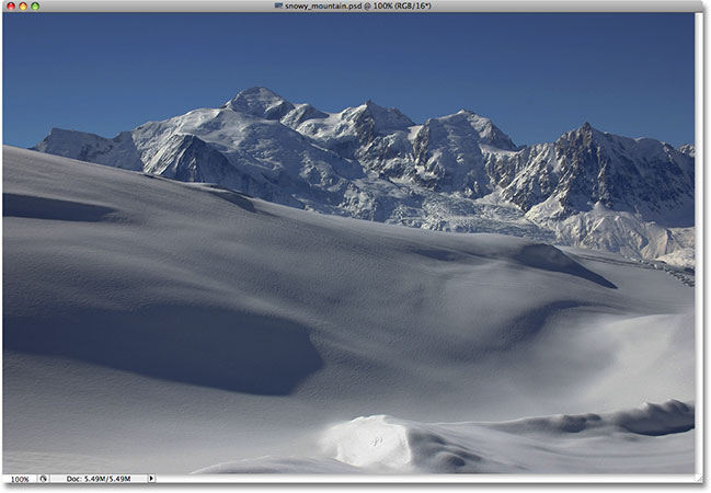
There's lots of good detail in the snow and in the mountains in the background, but the overall photo just isn't "popping" out at me the way I'd like. To find out what the problem might be, I'll take a look at my Histogram palette, which by default is grouped in with the Navigator and Info palettes. You can also select the Histogram palette from the Window menu if you don't see it anywhere on your screen.
With my Histogram palette selected, I'm going to click on the menu icon in the top right corner of the palette and choose the Expanded View mode, which increases the size of the histogram, allowing me to see all 256 brightness values from pure black on the far left to pure white on the far right (the default Compact View mode only shows 100 brightness values). I'm also going to make sure that the Channel option at the top of the palette is set to RGB, allowing me to view a composite of the Red, Green and Blue channels, the same histogram I would see by default if I brought up the Levels dialog box. A quick look at the histogram reveals the problem. There are currently no real shadows or highlights in the photo. All of the image information falls within the midtones, which we can tell because the main part of the histogram doesn't extend to either the far left (pure black) or the far right (pure white):

To fix the problem (or at least, try to fix the problem), I'll bring up the Brightness/Contrast command by clicking on the New Adjustment Layer icon at the bottom of the Layers palette and selecting Brightness/Contrast from the list of adjustment layers that appears:

This brings up the Brightness/Contrast dialog box, which doesn't look much different from the old days (as in, the days before Photoshop CS3). It still contains just two sliders - one for Brightness and one for Contrast - but as I mentioned, the difference is in how they work. At the moment, we're interested in how they used to work, so to switch to the "bad old days", all we need to do is select the Use Legacy option in the dialog box. With Use Legacy checked, we get the old version of the Brightness/Contrast command, and with it unchecked, we get the new version:

With the Use Legacy option selected, which means I'm currently using the old version of the command, I'm going to try increasing the brightness of my photo by clicking on the Brightness slider and dragging it towards the right. The further I drag the slider to the right, the brighter I'll make the image. There's no specific value to set the Brightness amount to, so I'll keep an eye on my image in the document window as I drag the slider. In this case, I think a value of around +40 is good enough:

Here's the image after increasing the brightness value:

The photo certainly does appear brighter at this point, but at what cost? Everything in the photo is now brighter, including the shadows which I didn't want to brighten, and I've lost image contrast because of it. The brightening effect looks more like there's a film or layer of dust covering the photo. Here's a "before and after" view to make it easier to see what's happened. The original image is on the left and the increased brightness version is on the right:

Let's take another look at our Histogram palette, where we can see what's happened. If you compare this histogram with the original one, you'll notice a strange thing - they look exactly the same! Every peak and valley looks exactly as it did originally, except for one key difference. The entire histogram has been moved over towards the right, as if I clicked on it and dragged it over with my mouse, and that's because every brightness level in the image has been lightened by exactly the same amount. The only part of the histogram that looks different at this point is the area on the far right, which has been pushed up into a tall spike along the right edge. This tells us that parts of our image where we used to have highlight detail have now been clipped to pure white:

By lightening every tone in the image, we've lost contrast, so the logical next step seems to be to try and fix it by increasing the amount of contrast with the Contrast slider. I'll click on the Contrast slider and drag it towards the right to about the same value that I dragged the Brightness slider a moment ago. Remember, we're still using the old version of the Brightness/Contrast command at the moment:

Let's look at the image:

Well, we've definitely brought back quite a bit of contrast, but again at what cost? We've blown out even more of our highlights to pure white, with large areas of snow along the bottom of the photo as well as in the mountains having lost all detail. In fact, the snow along the bottom now appears to be glowing! At this point, the image just looks harsh. It's brighter than it was originally, but with so much detail now missing, it would be tough to call it an improvement.
Here's what the histogram is showing. The spike on the far right is now even taller, telling us what we just saw with our own eyes, which is that we've clipped even more of our highlights to pure white, and if we look on the far left of the histogram, we can see another spike forming, this one telling us that we're starting to clip some shadow detail to pure black:

What's happened is that with the old version of the Contrast slider, Photoshop simply takes the brightness values in the image and stretches them out evenly left and right, as if someone was pushing down on the histogram trying to flatten it. The further you dragged the Contrast slider towards the right, the further apart you would stretch the brightness levels, and it wouldn't take much before you were clipping your highlights and shadows. Continue dragging and you'd clip even more of the image to black and white, with Photoshop happily allowing you to destroy the image without giving it a second thought. In fact, if you were to drag the Contrast slider all the way to the right to its maximum value of +100:

You could actually spread the brightness levels so far apart that there's virtually nothing left of the histogram other than tall spikes on each end:

If you think the histogram no longer looks too impressive, the image itself looks even worse:

Of course, you may argue that I've taken things to a bit of an extreme here, and I may tend to agree with you, but it was done purely to show just how bad of a command Brightness/Command used to be. Thankfully (and quite surprisingly), all that has changed as of Photoshop CS3. Let's take a look at just how big of an improvement the new version really is!
To switch the Brightness/Contrast command in Photoshop CS3 (and higher) over to the new version, I'll simply uncheck the Use Legacy option in the dialog box. This also resets the Brightness and Contrast sliders to 0:

The image has been reverted back to its original state:
And the histogram is also showing that we're back to our original brightness values:

Now that I'm working with the new, improved version of the Brightness/Contrast command, I'm going to increase my image brightness by once again dragging the Brightness slider towards the right. As with the old version of the command, dragging the Brightness slider towards the right increases brightness, while dragging the slider towards the left decreases it. Again, there is no specific brightness value to use since every image is different, so I'll keep an eye on my photo in the document window as I drag the slider. Last time, I increased the brightness value to +40, which resulted in some clipping of the highlights. This time, using the new version of the command, I'm going to increase the brightness even further to +50:

Let's take a look at the image. With the new version of the Brightness/Contrast command, we get a much better result. Even though I raised the brightness value even further than I did with the old version of the command, we've still maintained much of the darker tones, which means we were able to brighten the image while still keeping much of the contrast. It no longer has that faded "layer of dust" look to it that we ended up with last time:

If we look at the histogram, we can see that I also haven't clipped any of the highlights. As I mentioned at the beginning, the new version of the Brightness slider works much like the midtone slider in the Levels command. The lightest and darkest areas of the image now remain untouched for the most part as you drag the Brightness slider. Only the levels in between are brightened:

It is still possible to clip highlights if you drag the Brightness slider too far to the right (or clip shadows by dragging too far to the left if you're darkening the image), so you'll definitely want to keep an eye on your Histogram palette as you work, but the new version of the Brightness/Contrast command gives us a much larger range of movement with the slider before we run into any problems. In fact, while the old version of the Brightness slider only went as high as +100 (or as low as -100), the new version goes all the way up to +150 (or down to -150).
Let's try boosting the contrast of the image using the new version of the Contrast slider. Last time, I increased the contrast value to +40 which resulted in large areas of the highlights, and even a few shadows, being clipped. This time, with the new version of the command, I'll drag the Contrast slider all the way to +70. As with the Brightness slider, every image is different so there's no specific contrast value to use. I'm using +70 here only because it works well with this particular photo. You'll need to keep an eye on your image in the document window as you drag the slider to judge the results:

Here's the photo after increasing the contrast. Even though I raised the contrast level far beyond the value I used with the old version of the Brightness/Contrast command, there are no visible signs of any shadow or highlight clipping:

To confirm that we haven't clipped any highlights or shadows, let's take a look at the histogram. Sure enough, the histogram looks great! It now extends all the way across the tonal range from black to white without clipping a single highlight or shadow:

At this point, I'm happy with the results. The improved Brightness/Contrast adjustment in Photoshop CS3 has made it easy to add life to a dull, flat image without the horrible clipping problems that the command has suffered with throughout most of Photoshop's lifetime. In fact, just to demonstrate how much better Brightness/Contrast in Photoshop CS3 really is, I'm going to drag the Contrast slider all the way to the right to its maximum value of +100:

Remember what happened when I did this using the old version of the command? When we looked at the histogram, we saw that it had virtually disappeared, leaving only tall spikes on either side indicating that most of the image detail had been clipped to pure black or white. This time, with the new version, even though I've increased the contrast value to its maximum, we see no such problem in the histogram. There is some minor highlight detail being clipped, but it took raising the contrast value all the way to +100 before running into the problem:

With the old version, the image was completely destroyed at this point, looking more like a weird special effect than a retouched photo. But with the new version of the Brightness/Contrast command in Photoshop CS3, even with the contrast value maxed out, the image still looks great:

As I mentioned at the beginning, even with its major improvements, the Brightness/Contrast command still isn't the most professional way to improve tone and contrast in a photo. For important images, you'll want to stick with Levels or Curves to get things right. But if all you need is a quick, no hassle way to brighten or boost the contrast of an image and you have a copy of Photoshop CS3 or higher, just add a Brightness/Contrast adjustment layer, make sure the Use Legacy option is unchecked, and drag the Brightness and Contrast sliders as needed (while keeping an eye on the Histogram palette of course). After years of destroying images, the Brightness/Contrast command in Photoshop finally works the way you'd expect, and it doesn't get much easier than this.
And there we have it! Check out our Photo Retouching section for more Photoshop image editing tutorials!